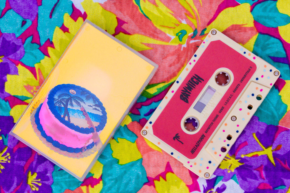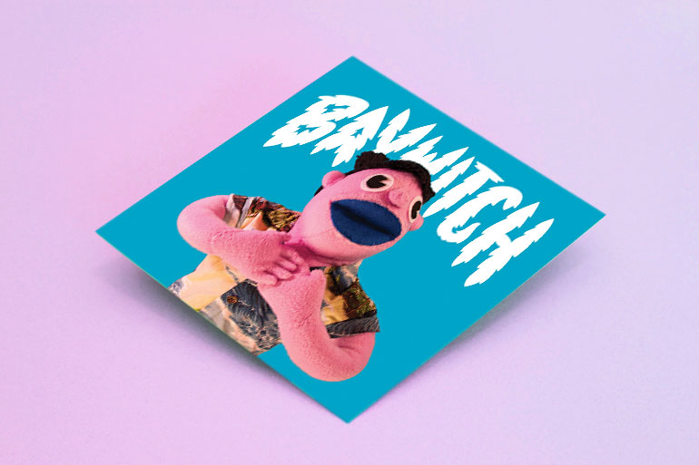
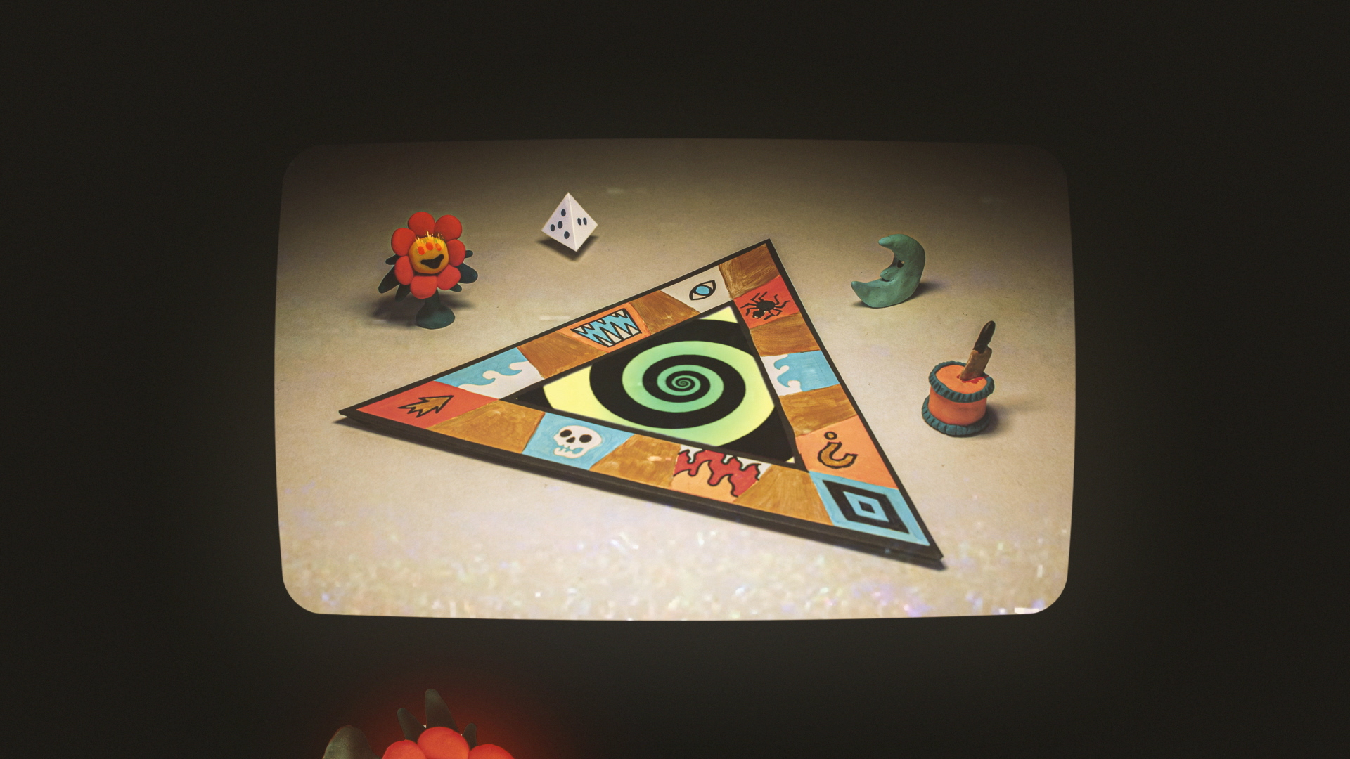
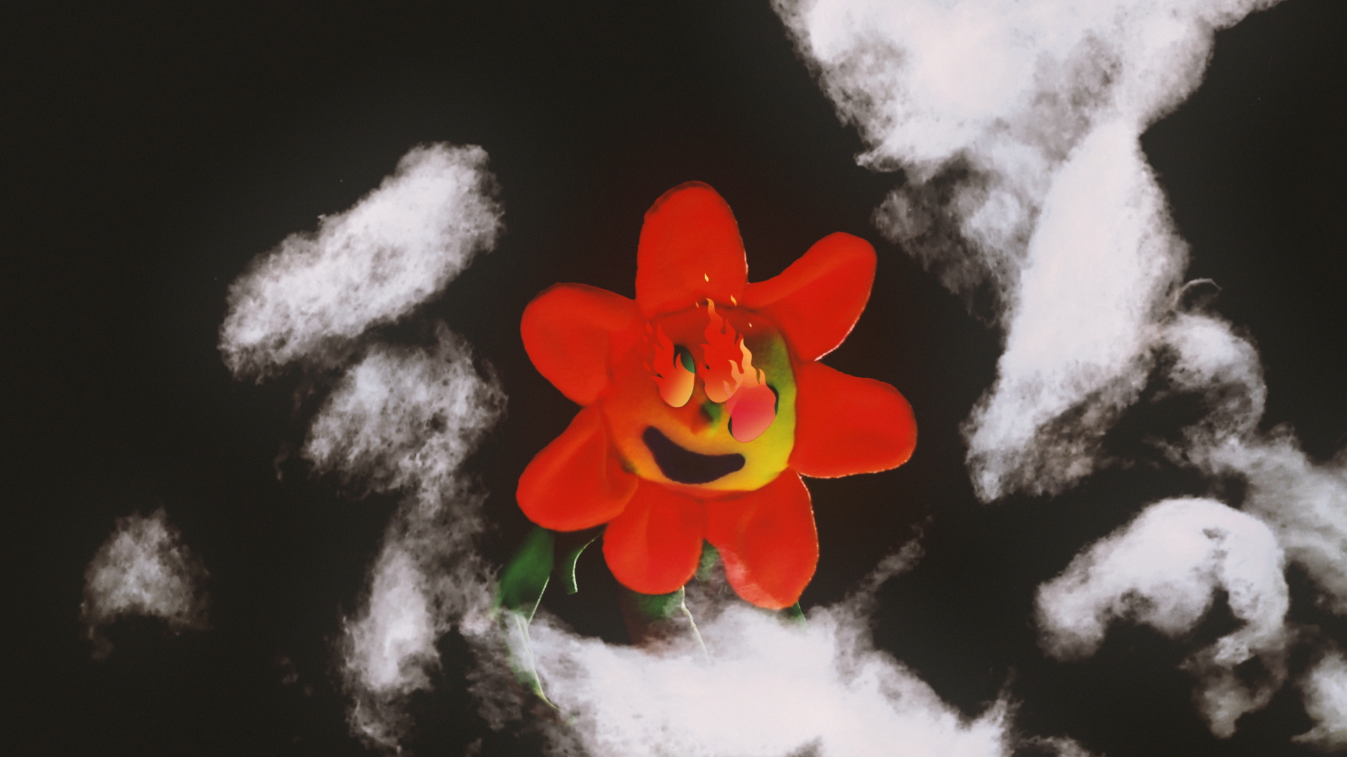
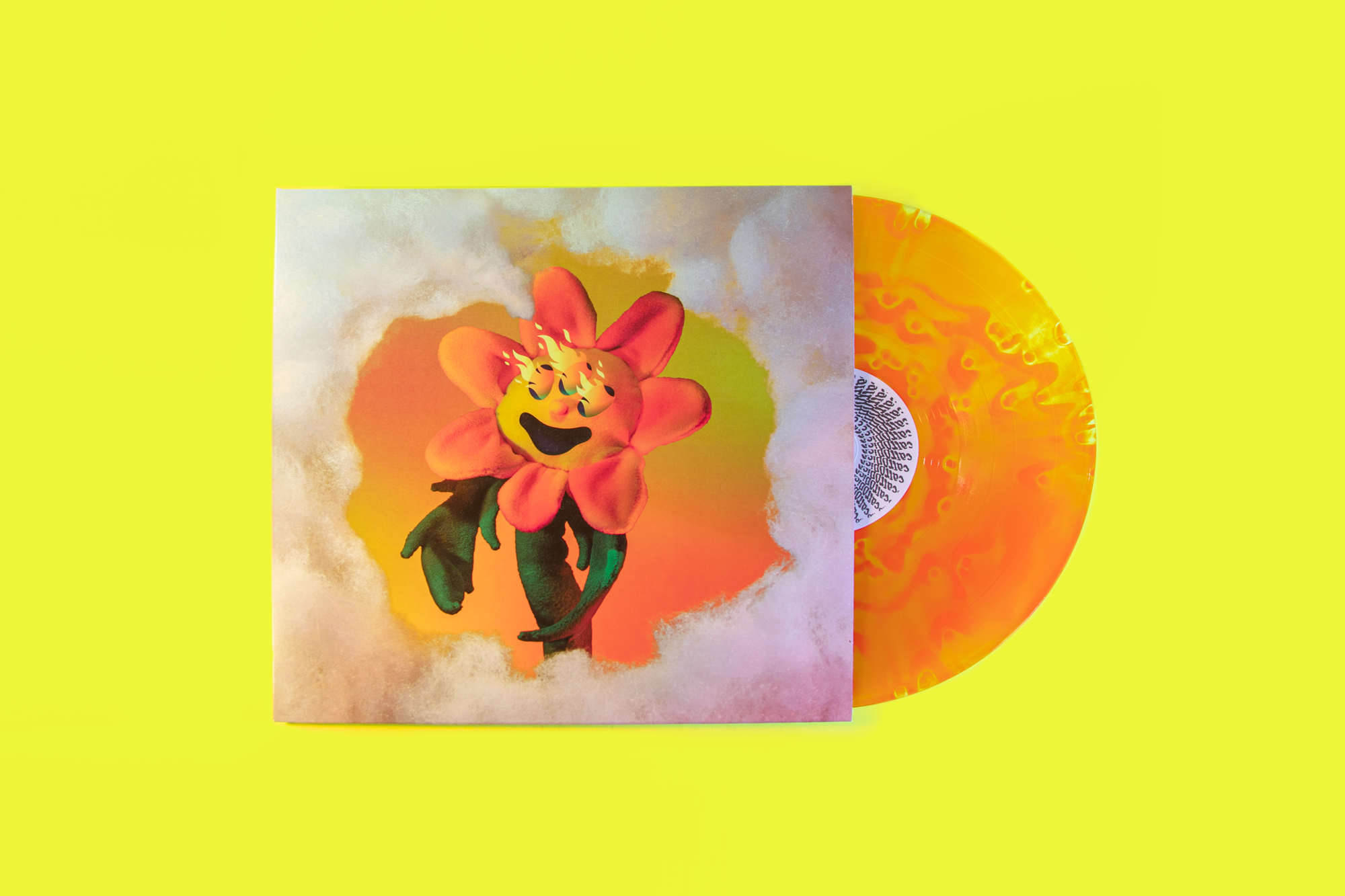
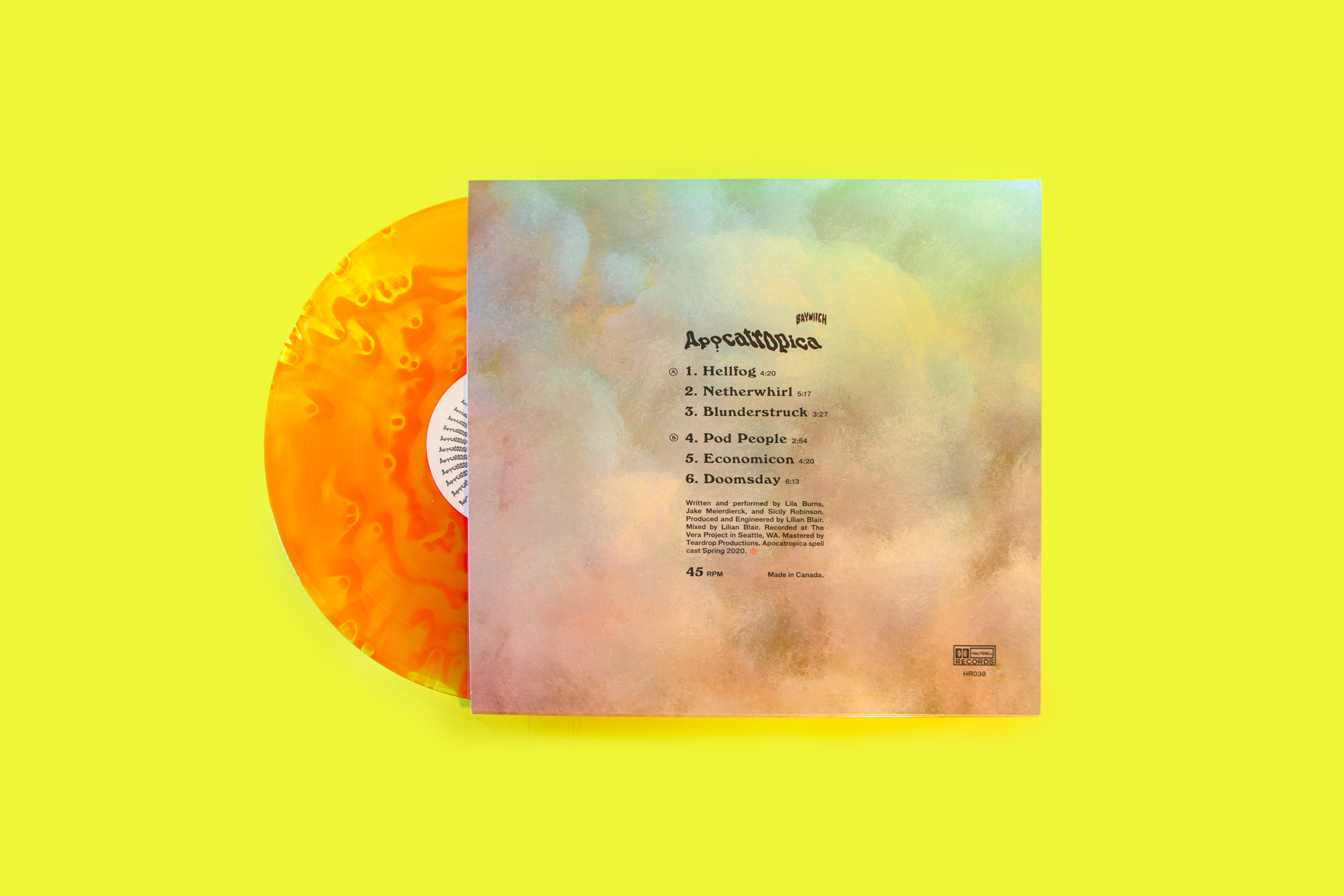
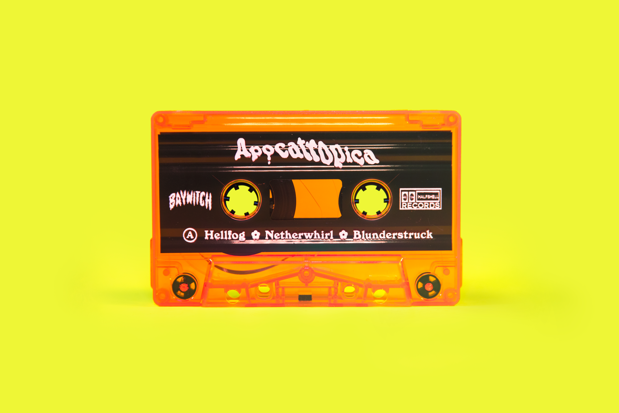
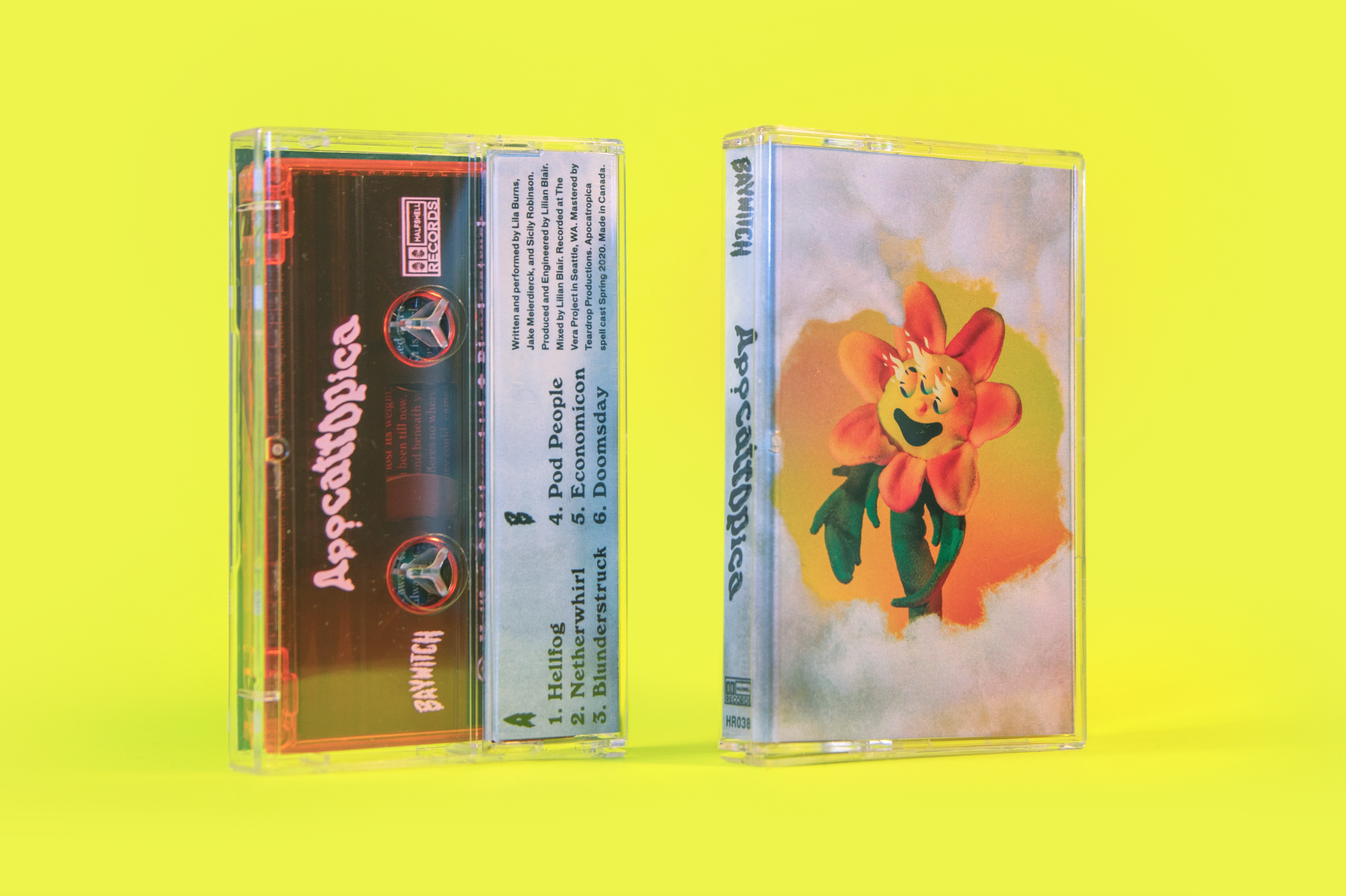
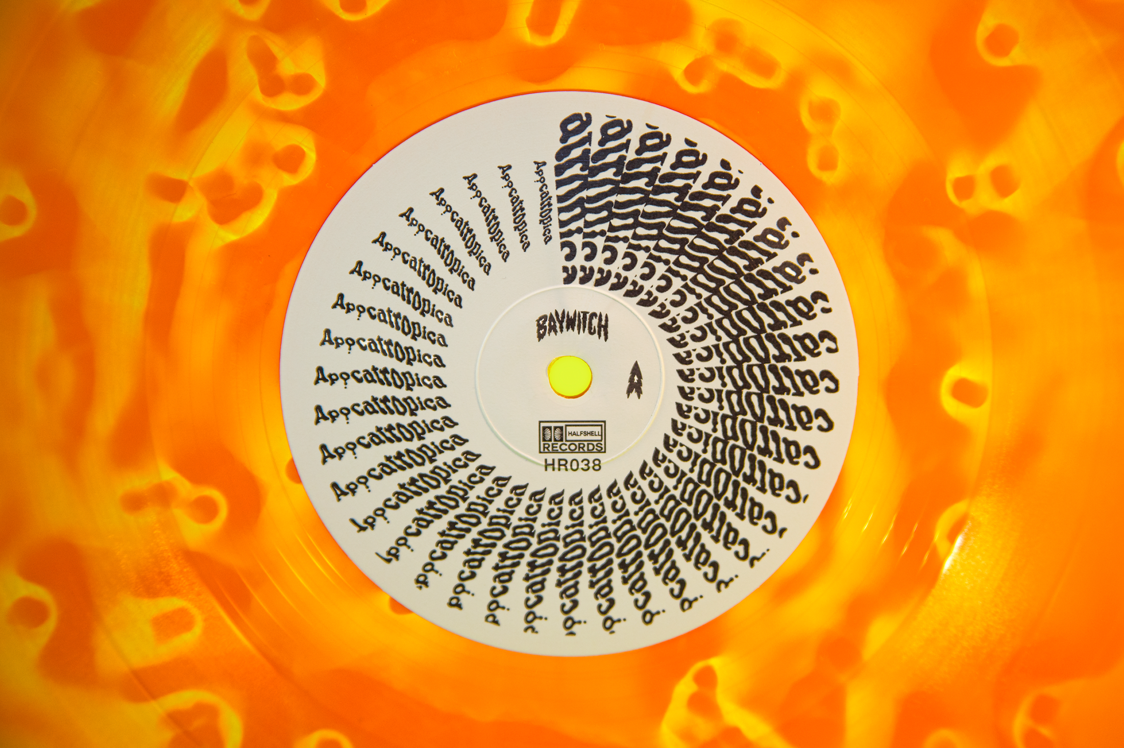
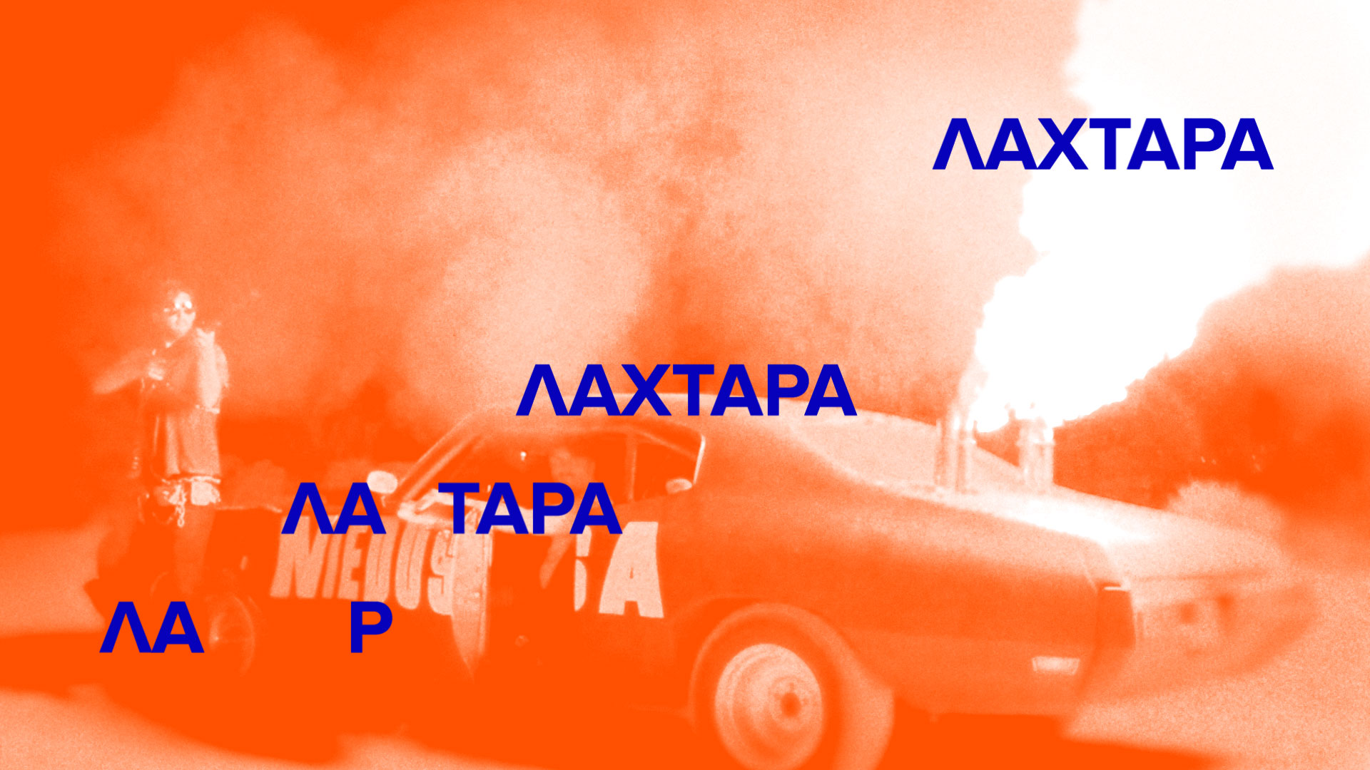
Album sampler and graphics for Baywitch’s 3rd album Apocatropica out on Halfshell Records.
Music video for Portland band Plastic Cactus for their 2019 single “Mystery Boy” starring Dustin Simensen. Filmed around town at Freakybuttrue Peculiarium, Music Millennium, Clyde’s Prime Rib, Stumptown Coffee, Avalon Theater, and the band’s basement where we also spent a few days building the Mystery costumes, instruments, and sets together.
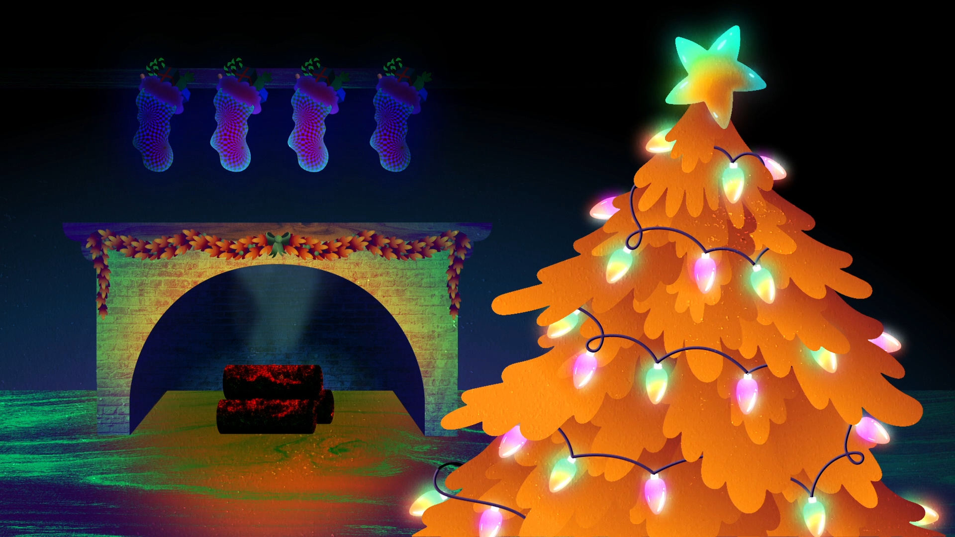
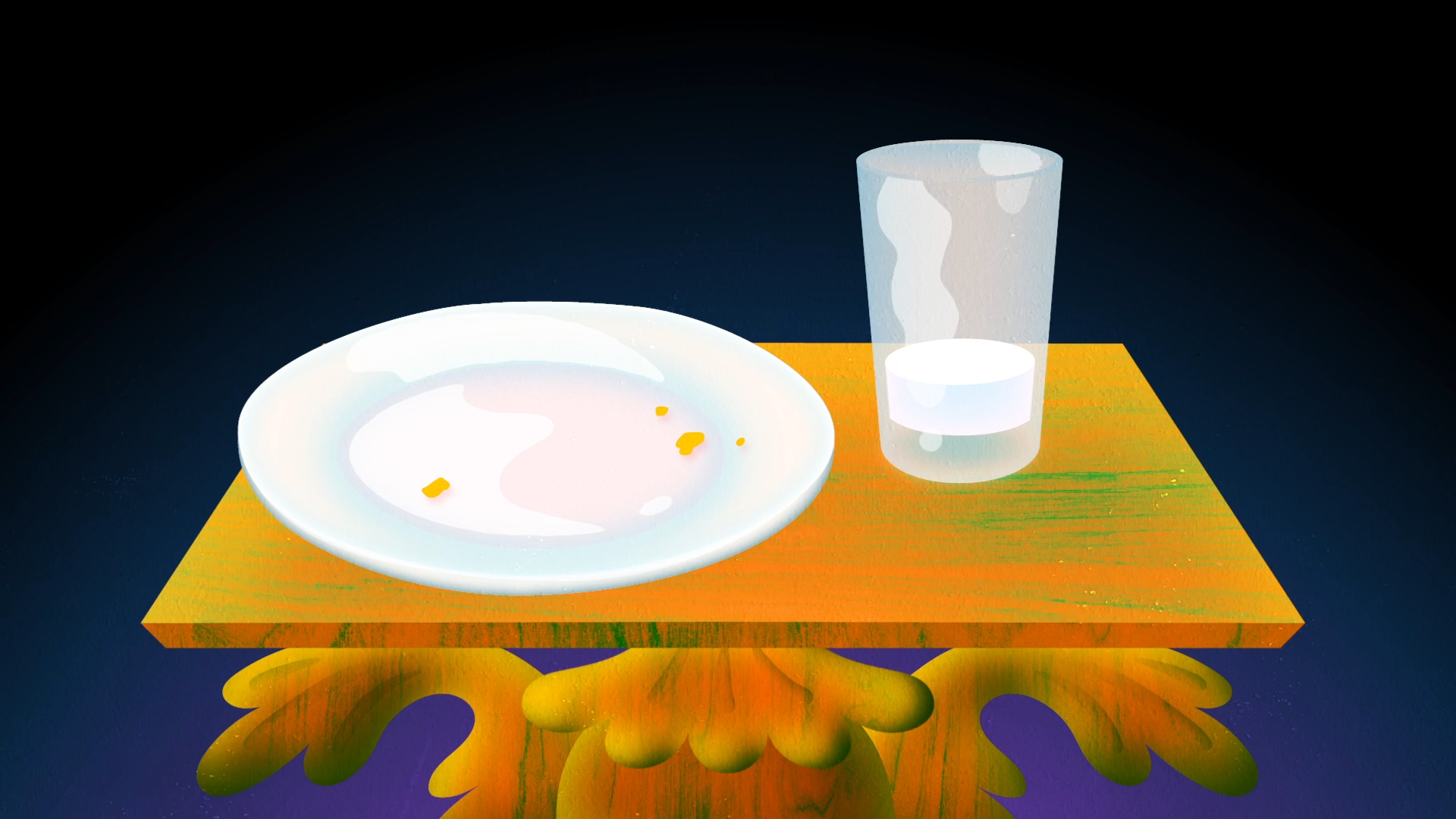
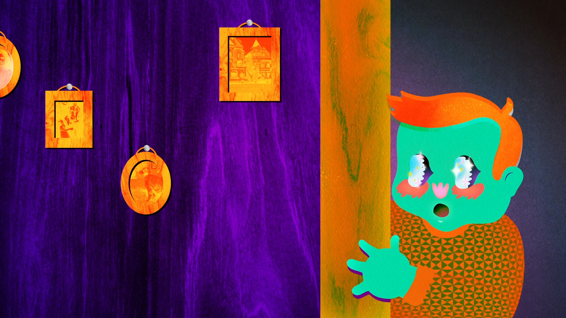
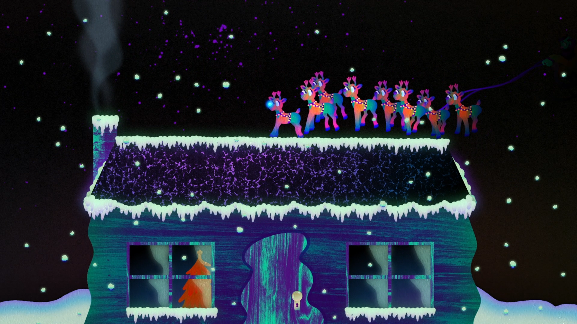
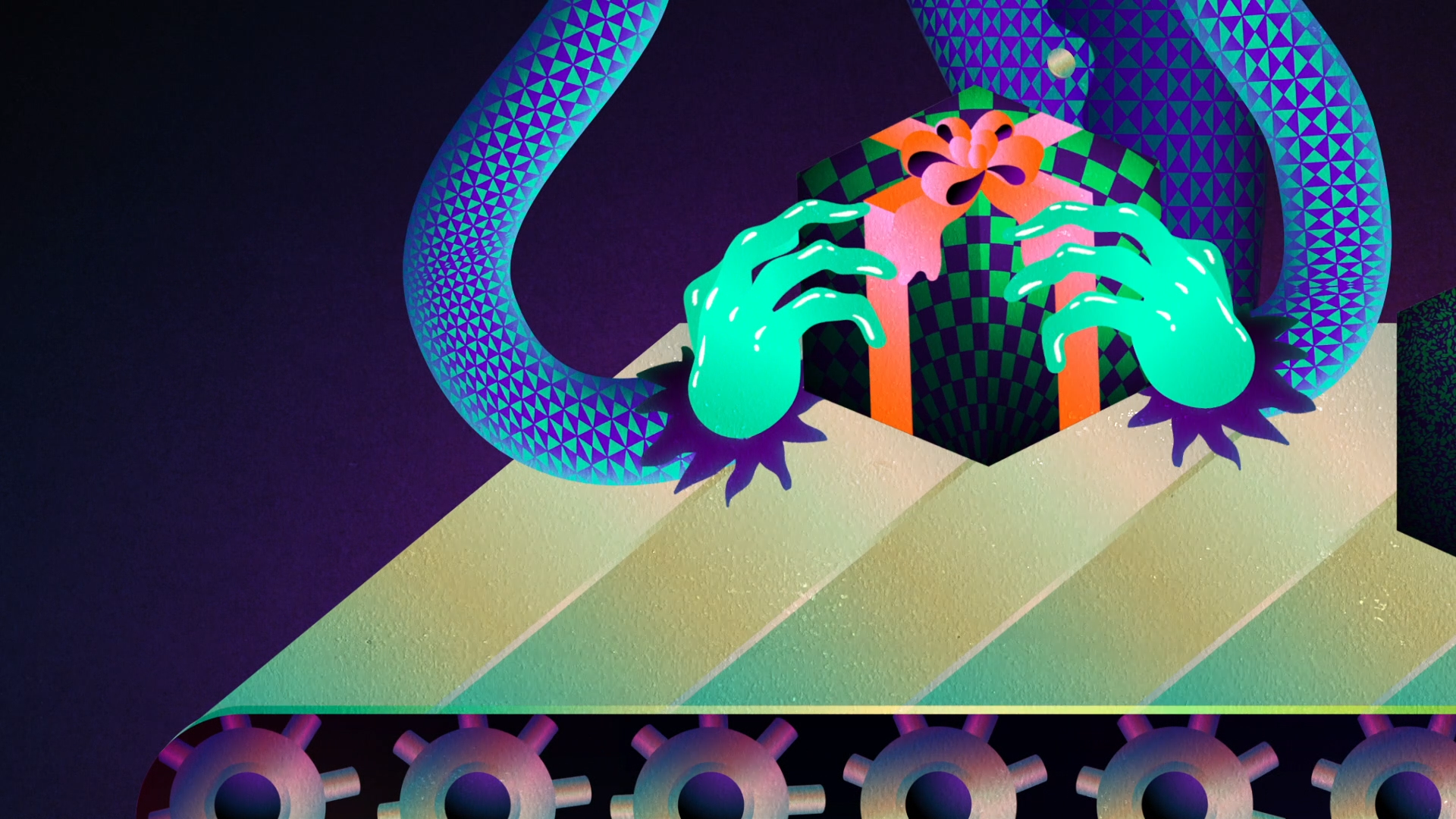
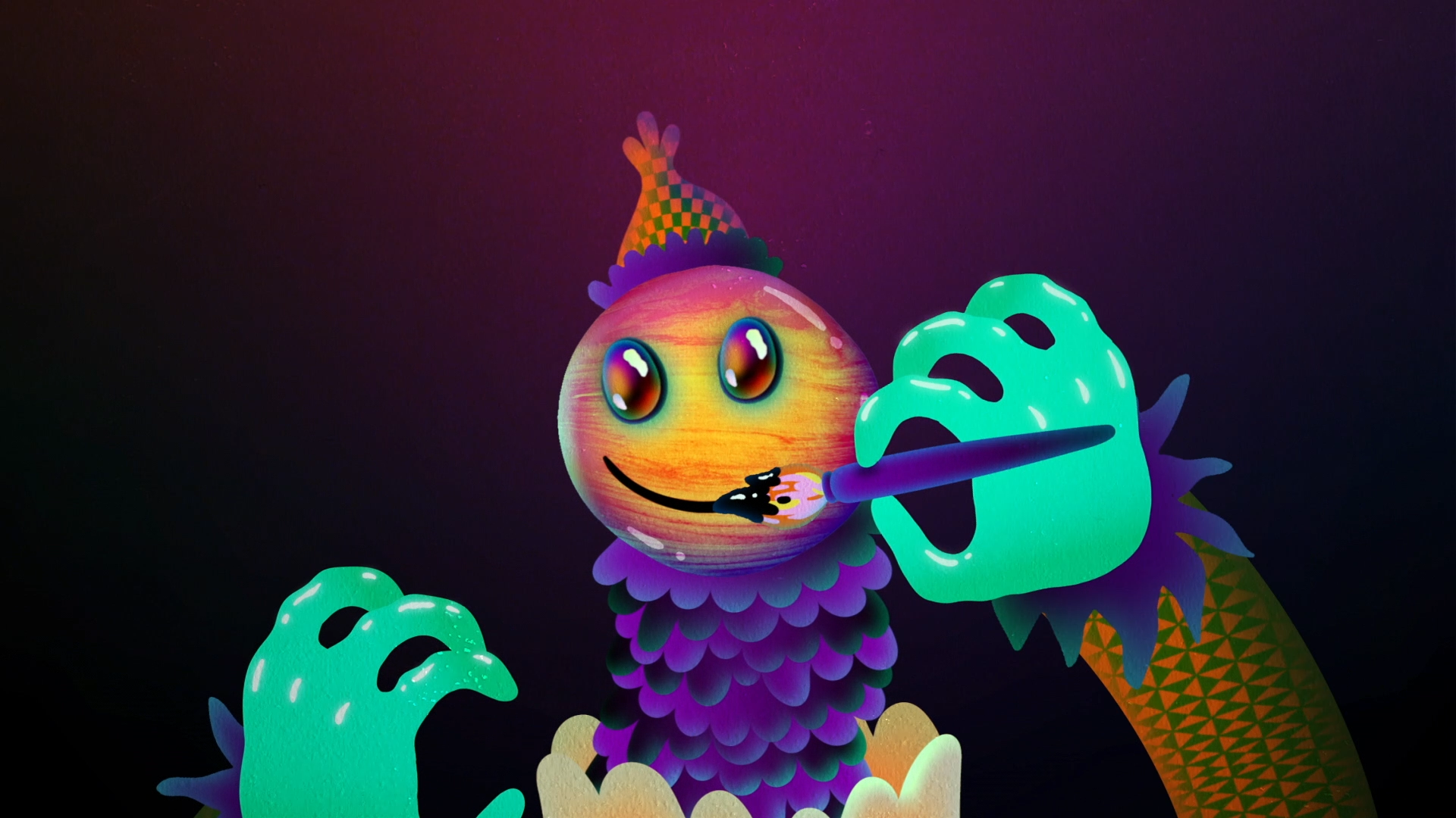
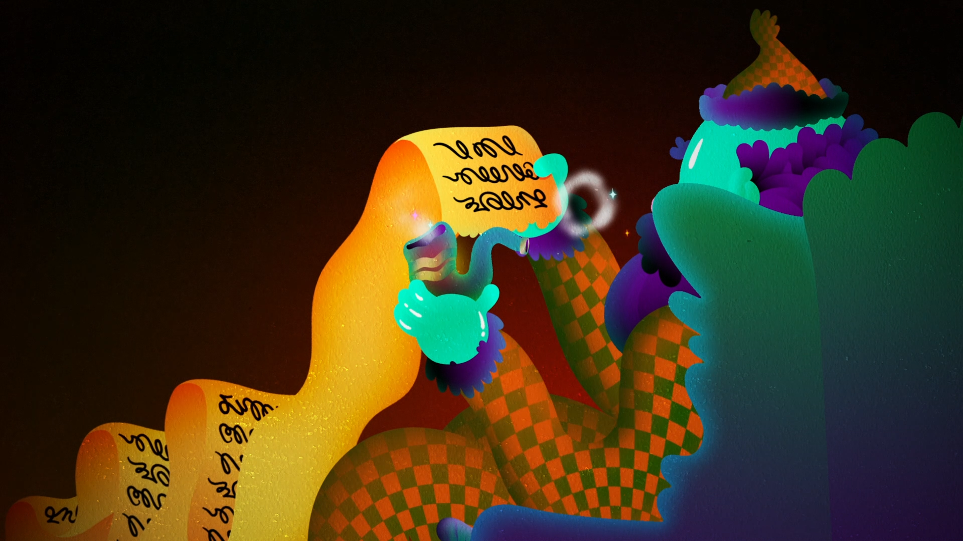
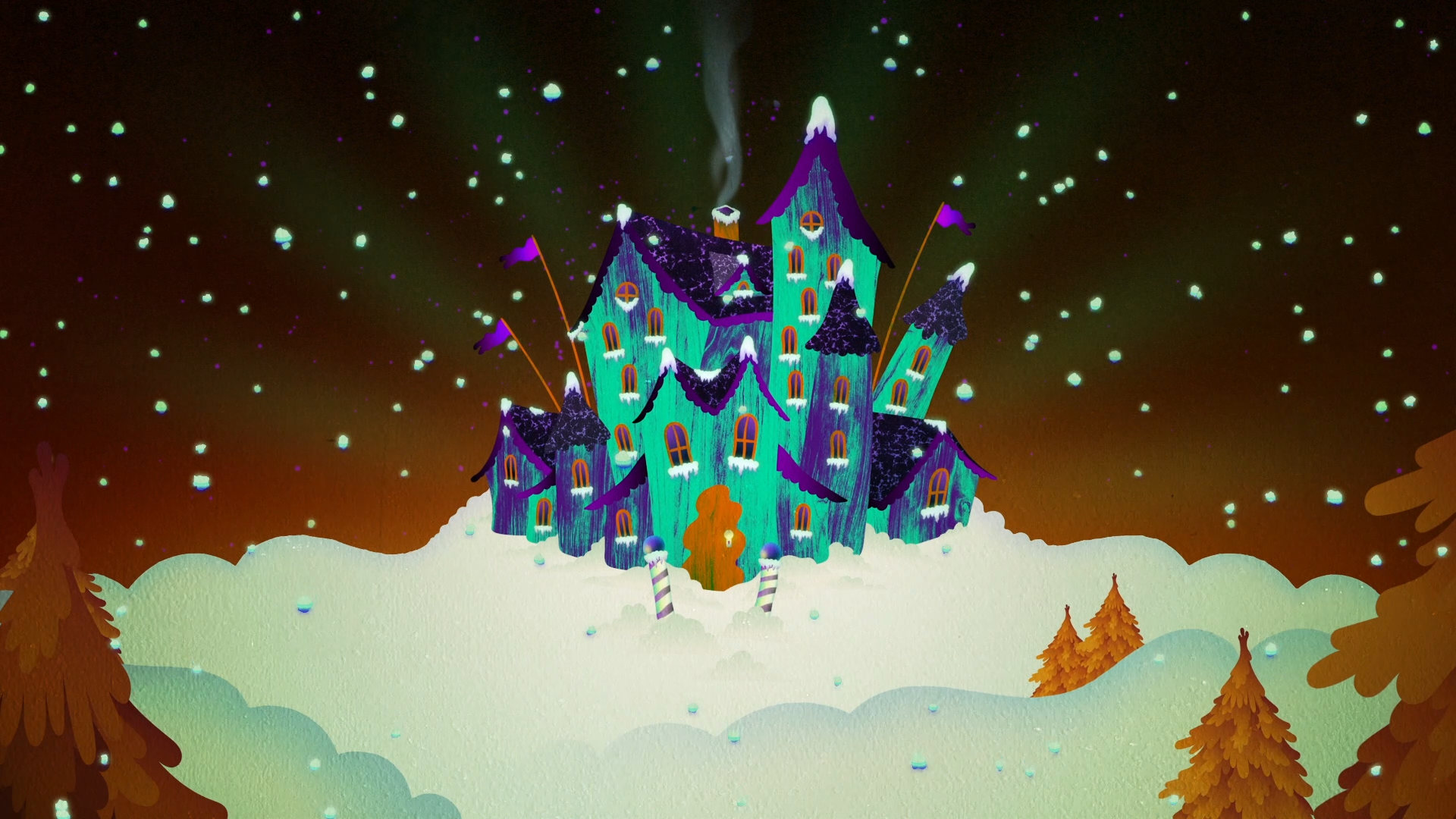
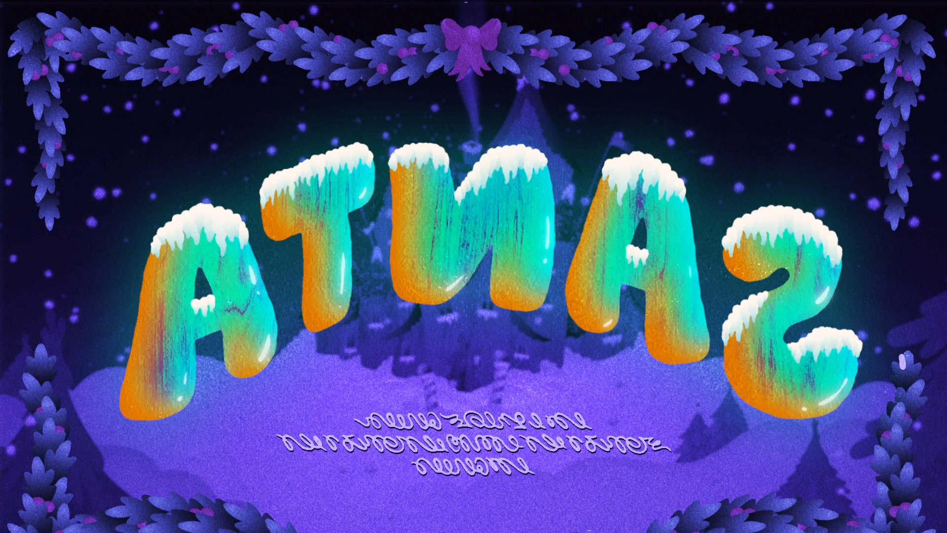
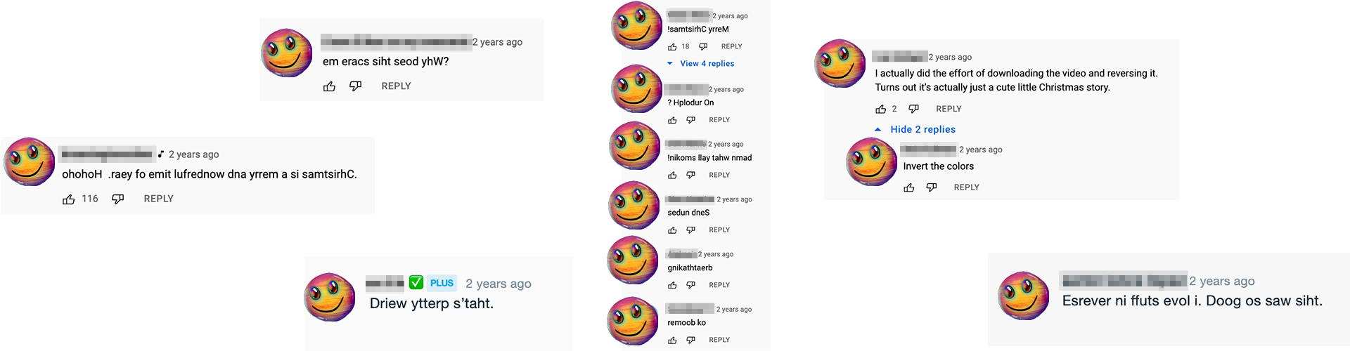
Short film created for [Adult Swim] Smalls — a classic Santa story in reverse, inverse, backwards and rewound. The goal was to make something that could theoretically be actually enjoyed multiple ways, which meant figuring out how to make “backwards” sound effects, music and colorways that would still read. A viewer even uploaded a backwards bootleg!
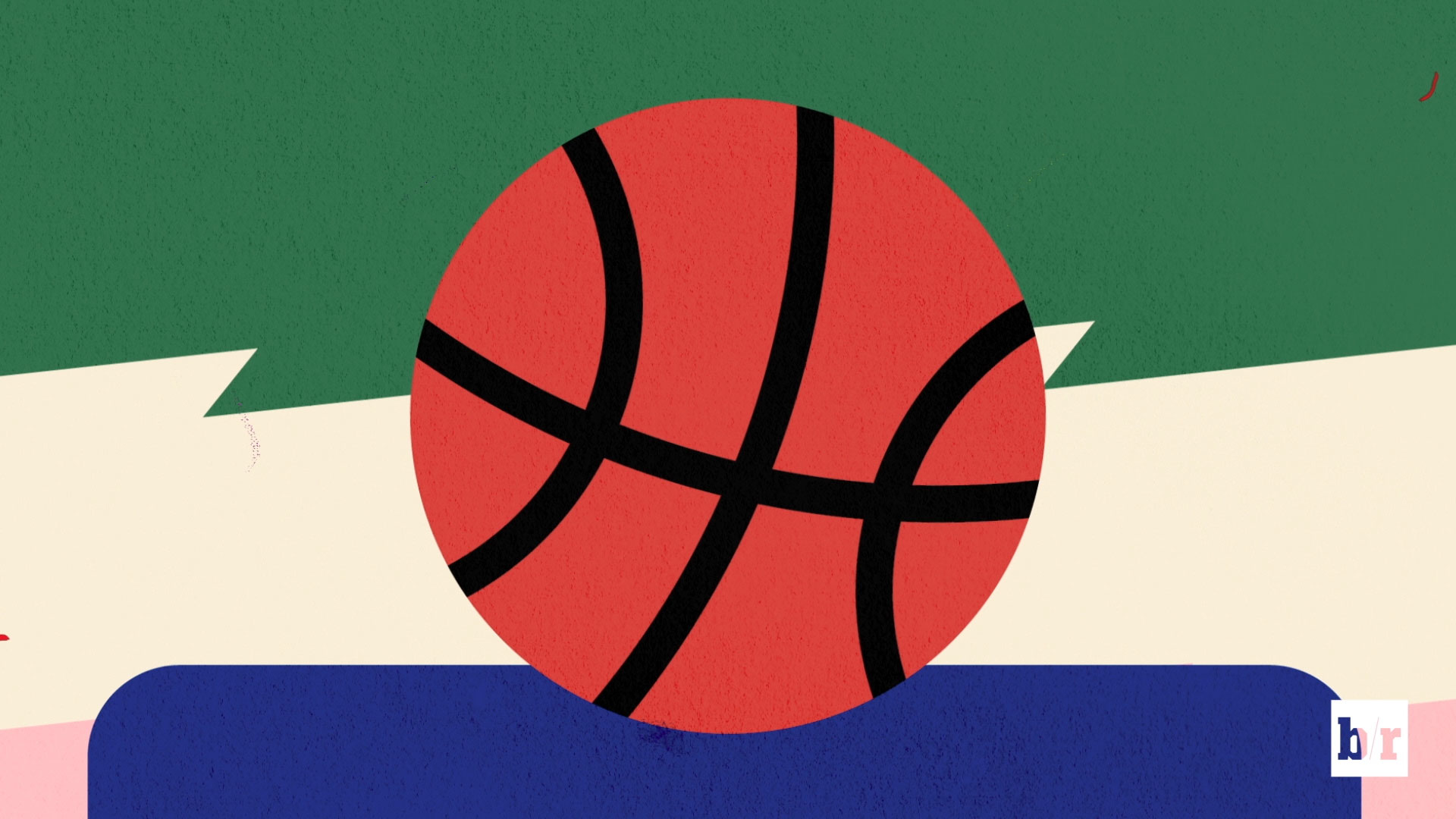
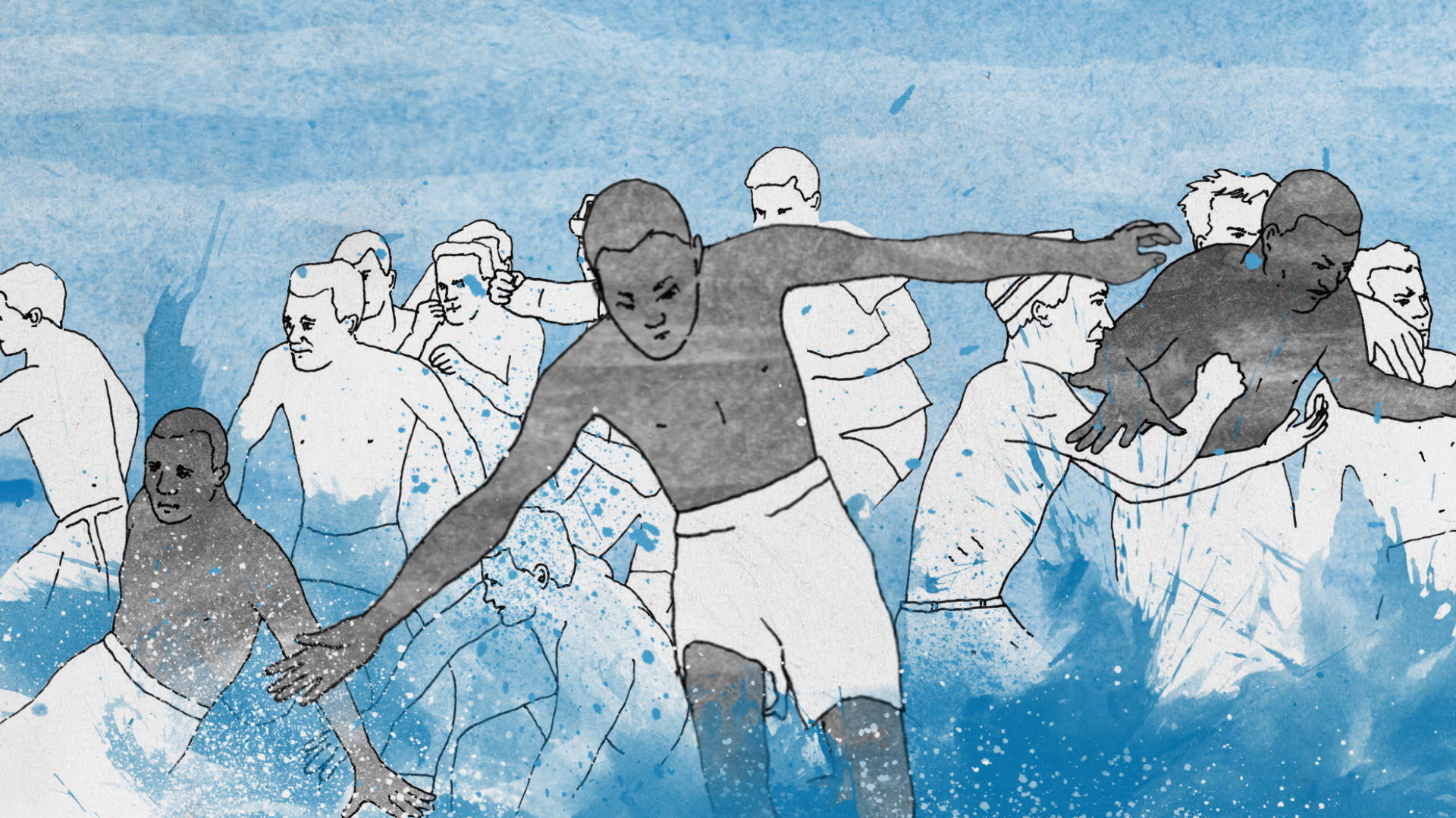
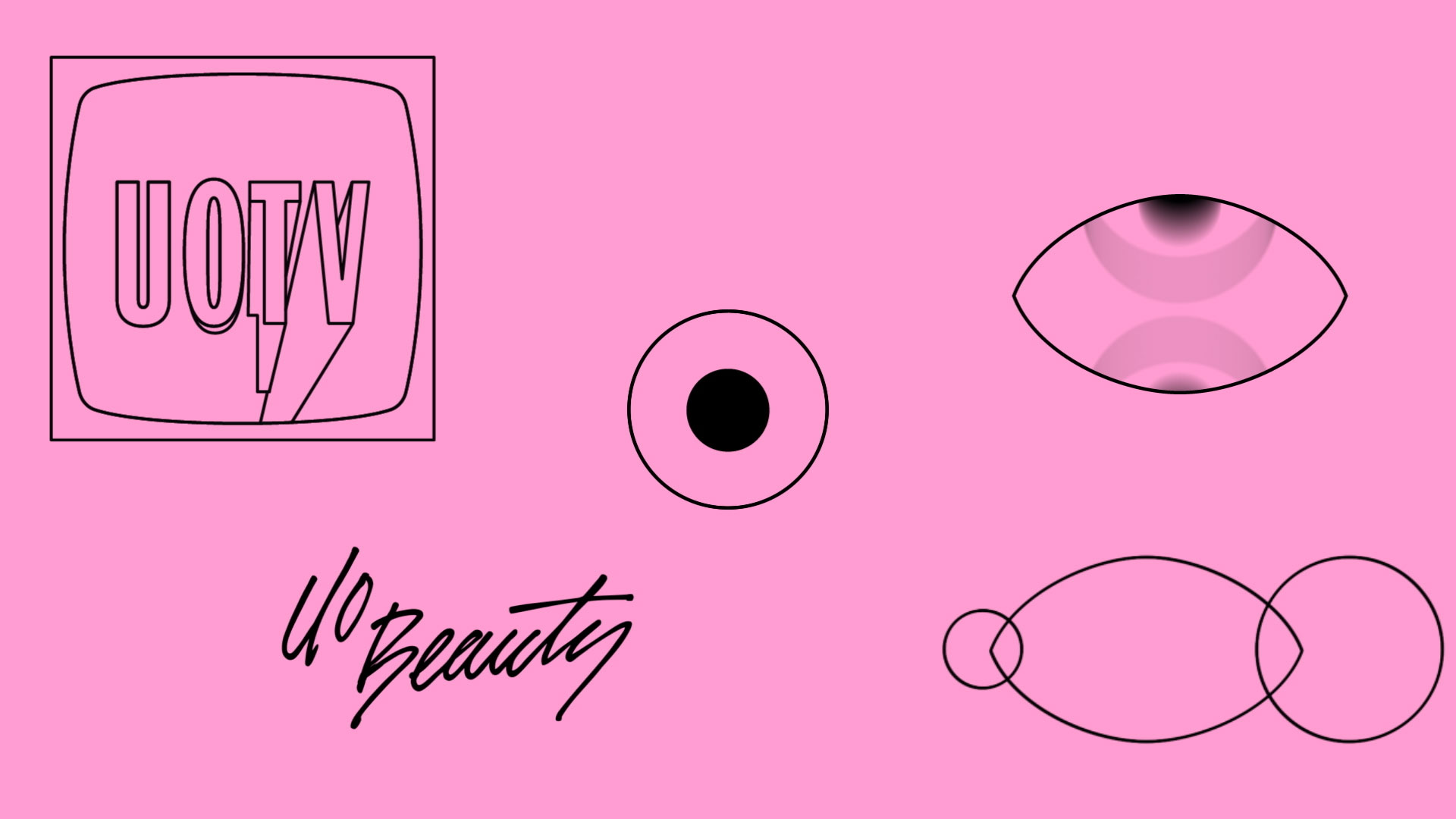
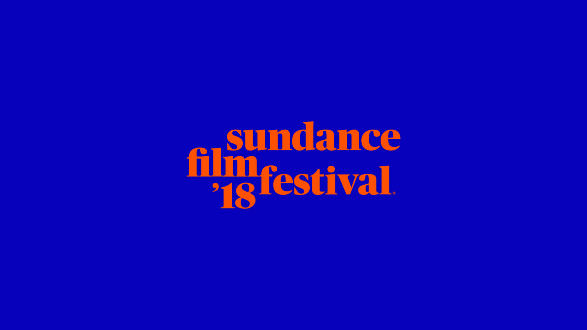
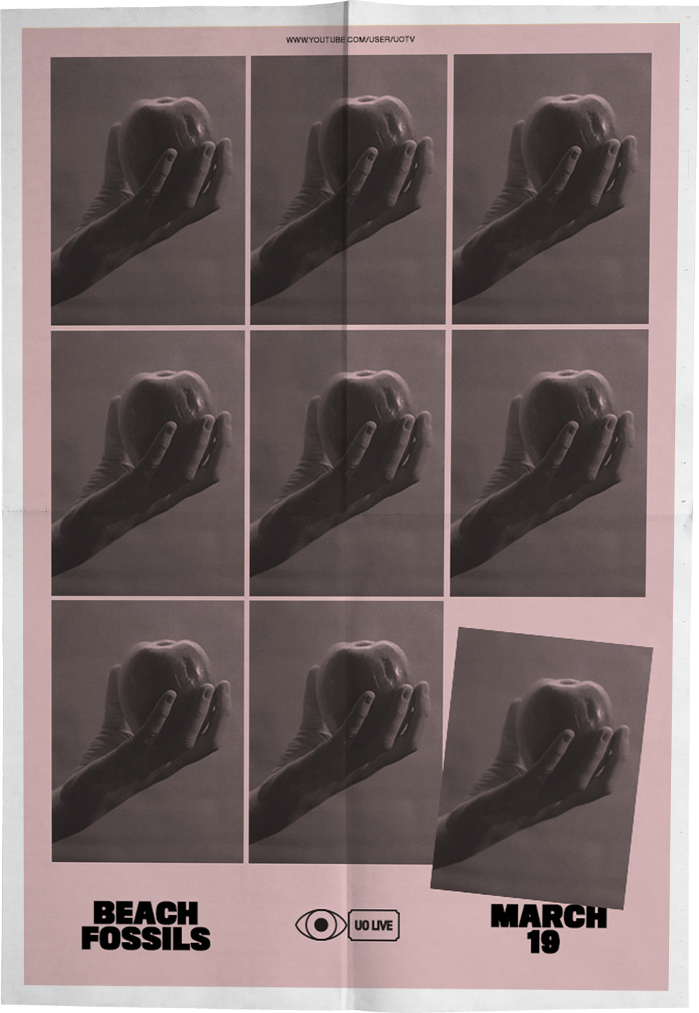
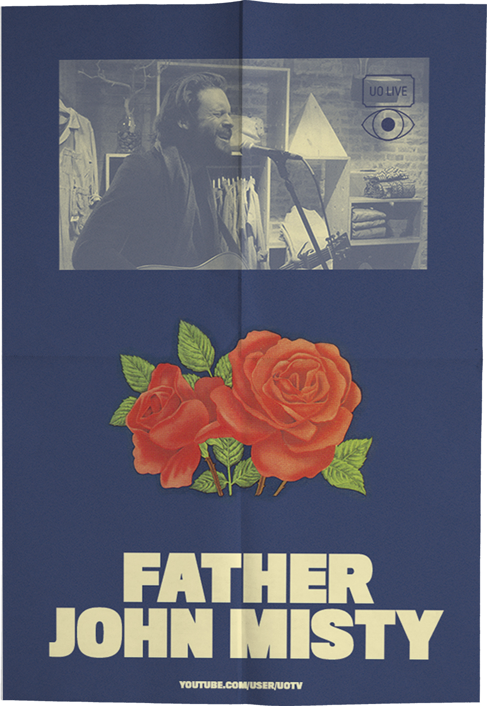
Smithsonian / National African American Museum of History and Culture #APeoplesJourney (Whirled), Sundance Film Festival ’18 (Jennifer Rider Studio), ‘Why Should I Be A Running Back?’ (Bleacher Report), UOTV/UOBeauty/UOLive (Urban Outfitters), Staywatch with Baywitch Pilot, Off The Air: Words (Adult Swim), Weird Algorithm (Adult Swim Streams), and Sundae Crush’s “Dating Game 3000” Music Video.
Bumper created for the Northwest Film Forum‘s 2018 Local Sightings Film Festival combining sculpture, live action, 2D animation and audio samples.
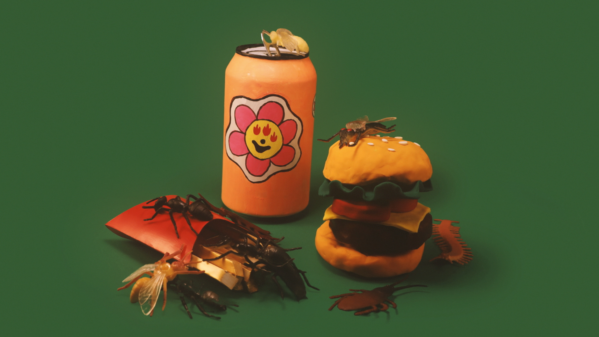
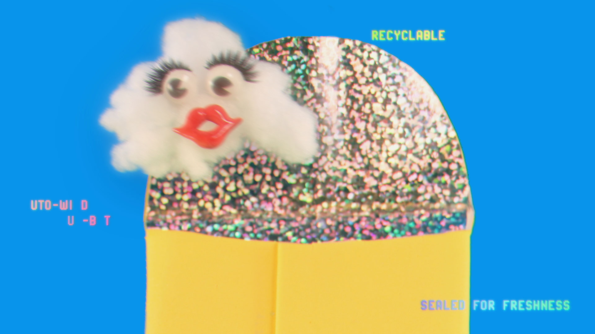
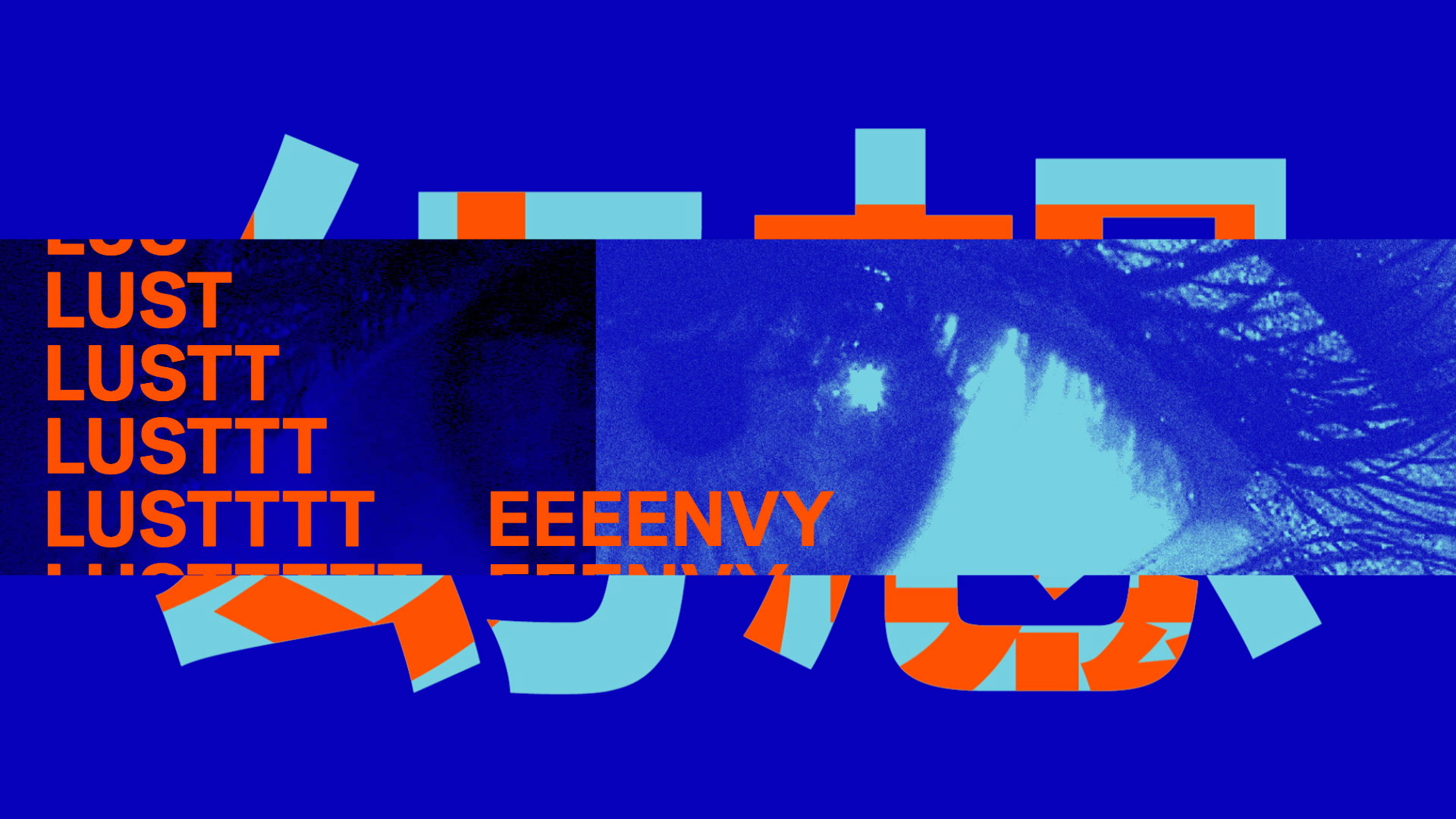
Two short films created for the [Adult Swim] streams advertising a series of wild and magical products based on fictitious marketing algorithms. Voiceover by Casey Fischer.
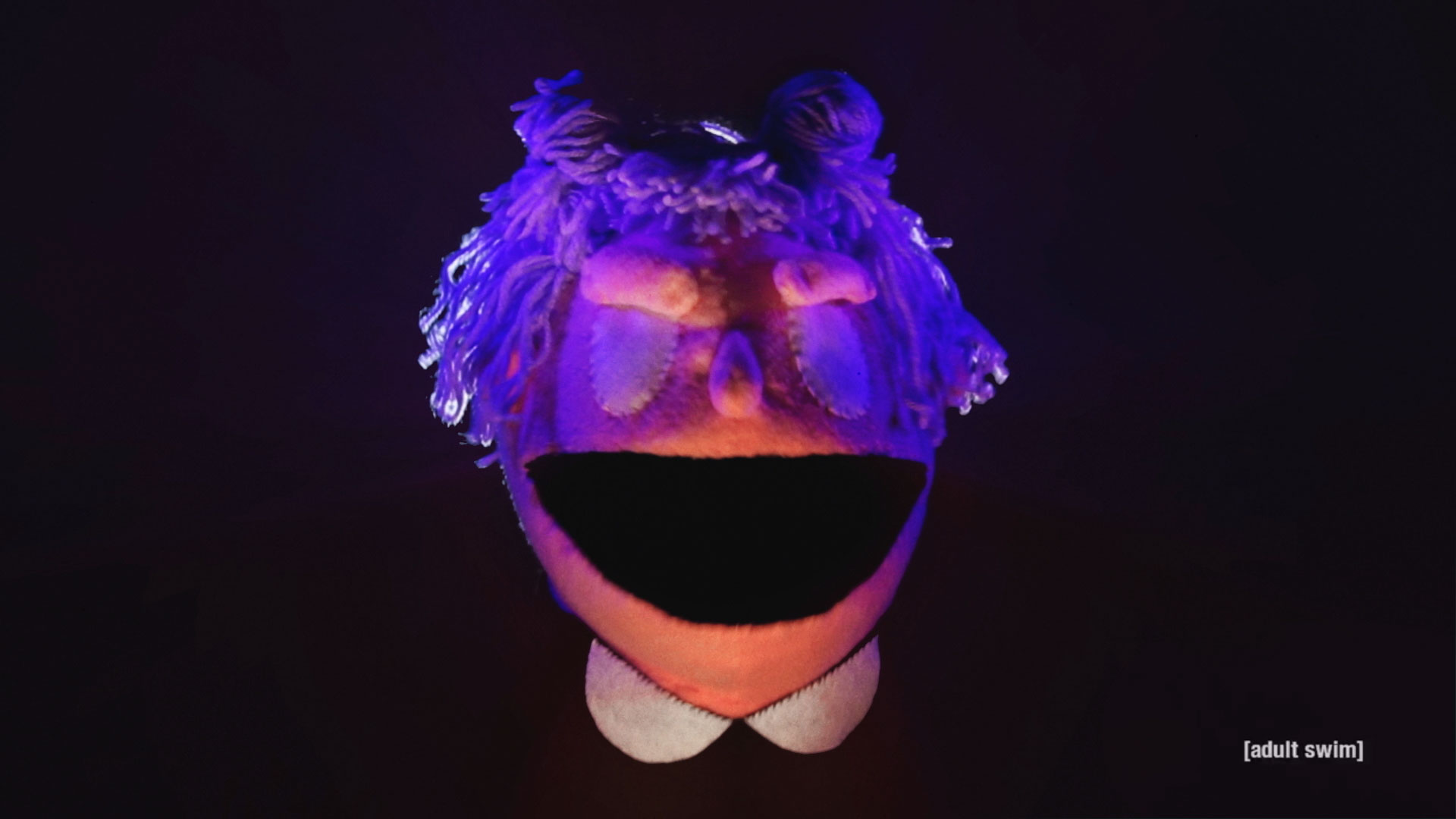
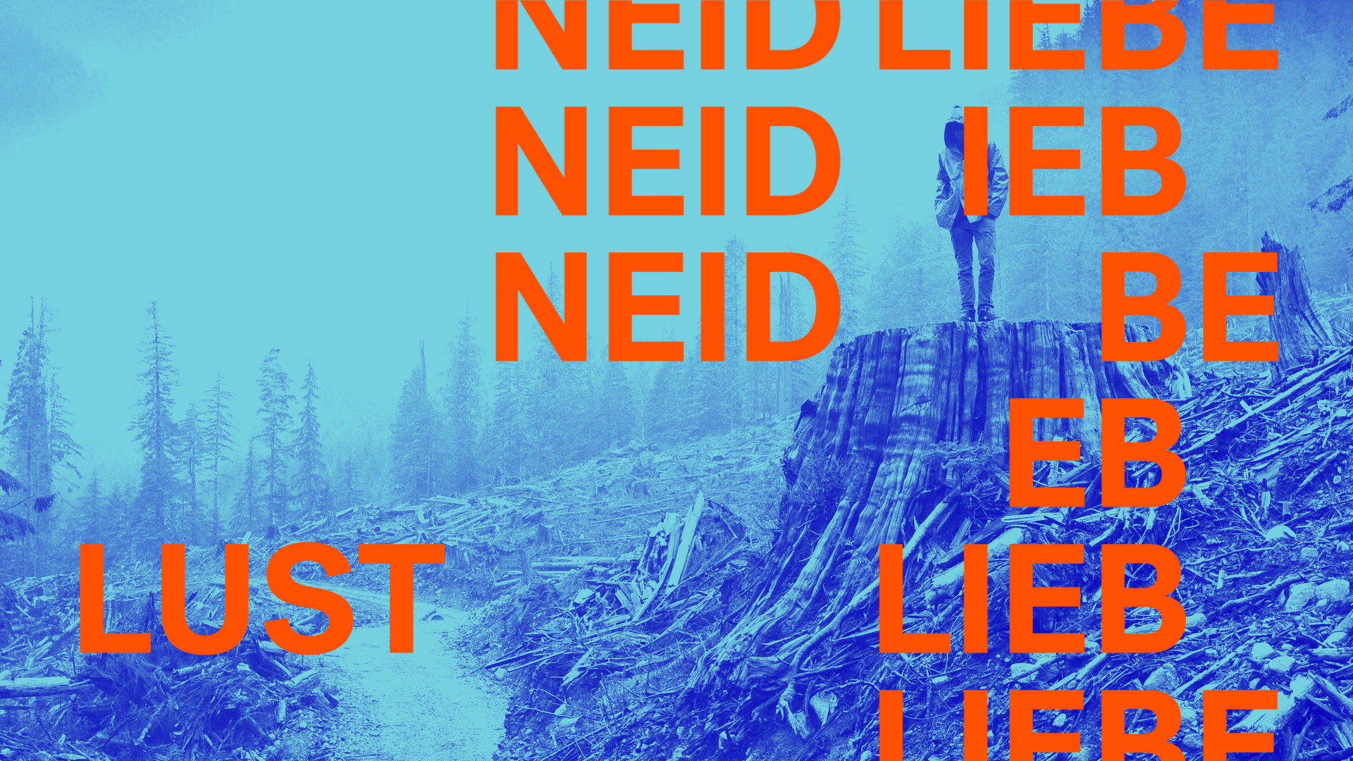
A puppet short created for the Off the Air’s “Love” episode featuring a mysterious fortune teller.
A puppet short created for the Off the Air’s “Words” episode where we learn what rhymes with orange.
Working together with Jennifer Rider Studio, we created a trailer, as well as a corresponding motion assets based on this year’s theme of using language to be both inclusive and disruptive through a combination of past film stills and a variety of languages.
A series of short educational films for the Smithsonian National African American Museum of History and Culture’s youtube page; created in collaboration with Whirled.
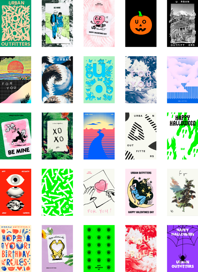
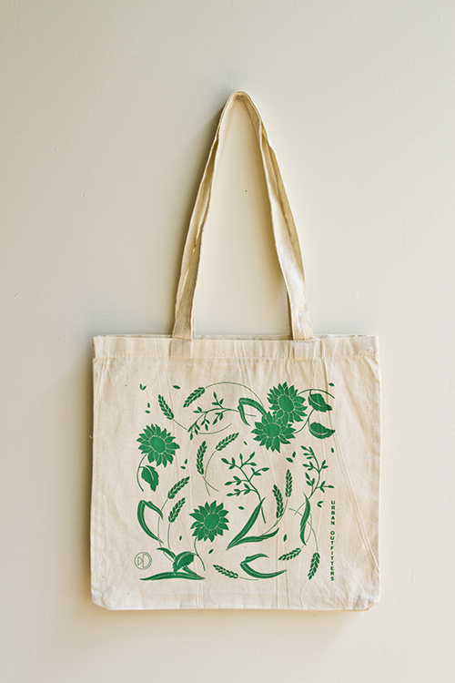
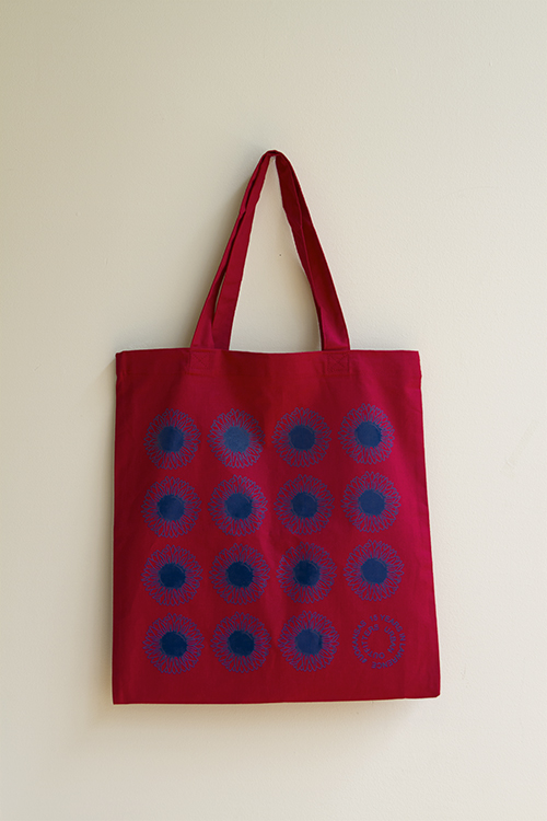
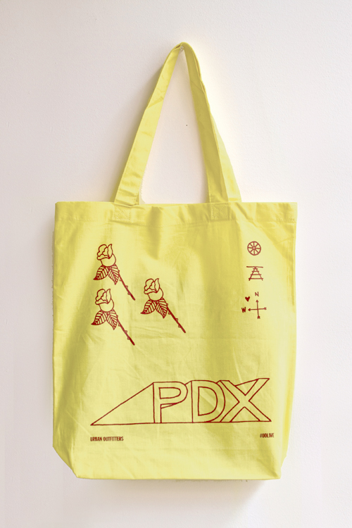
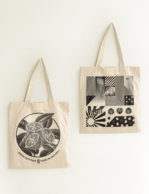
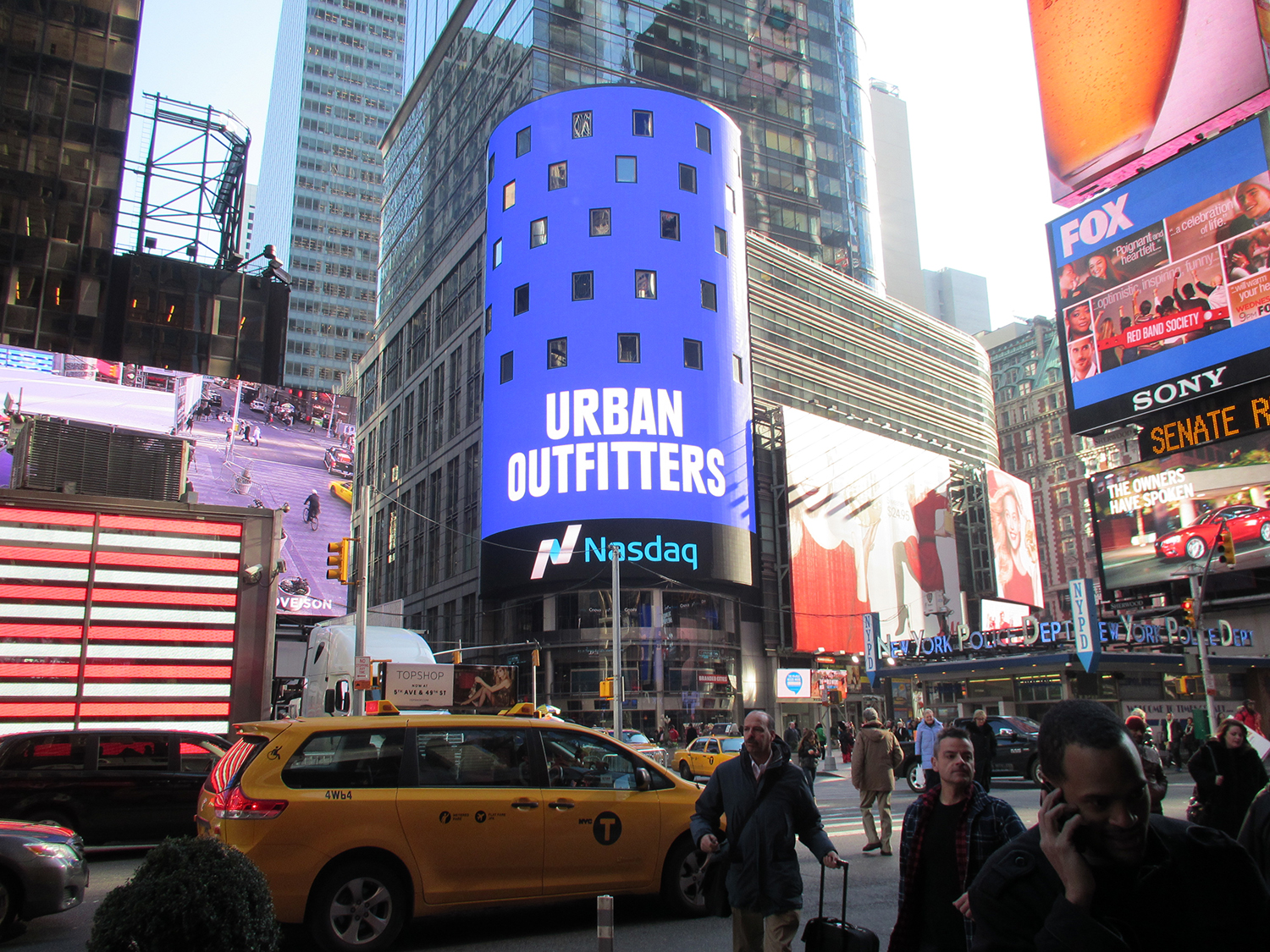
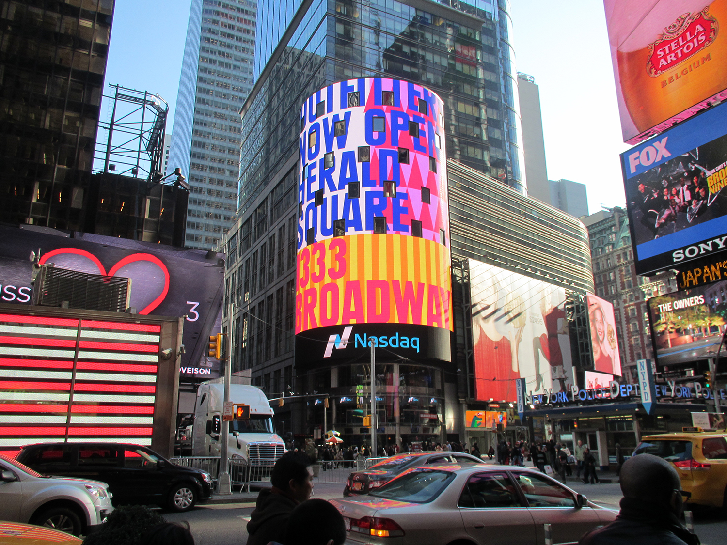
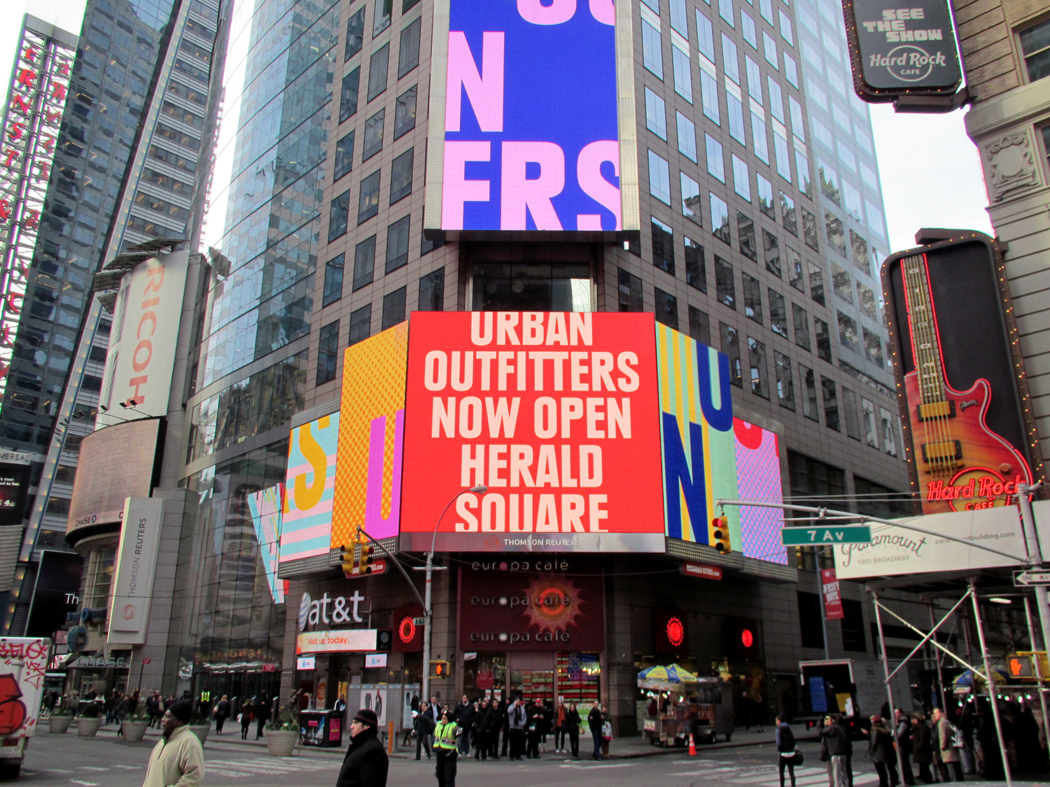
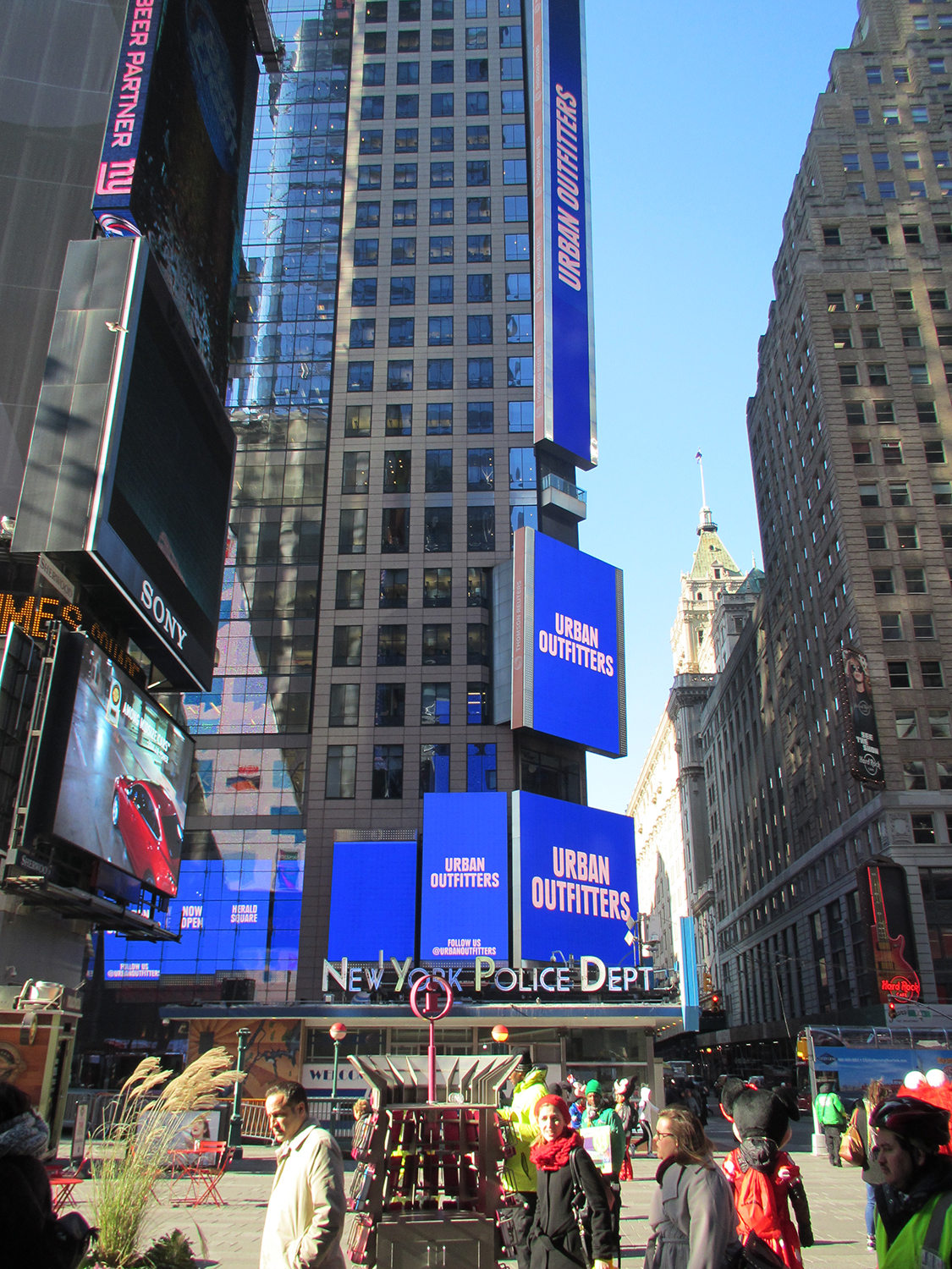
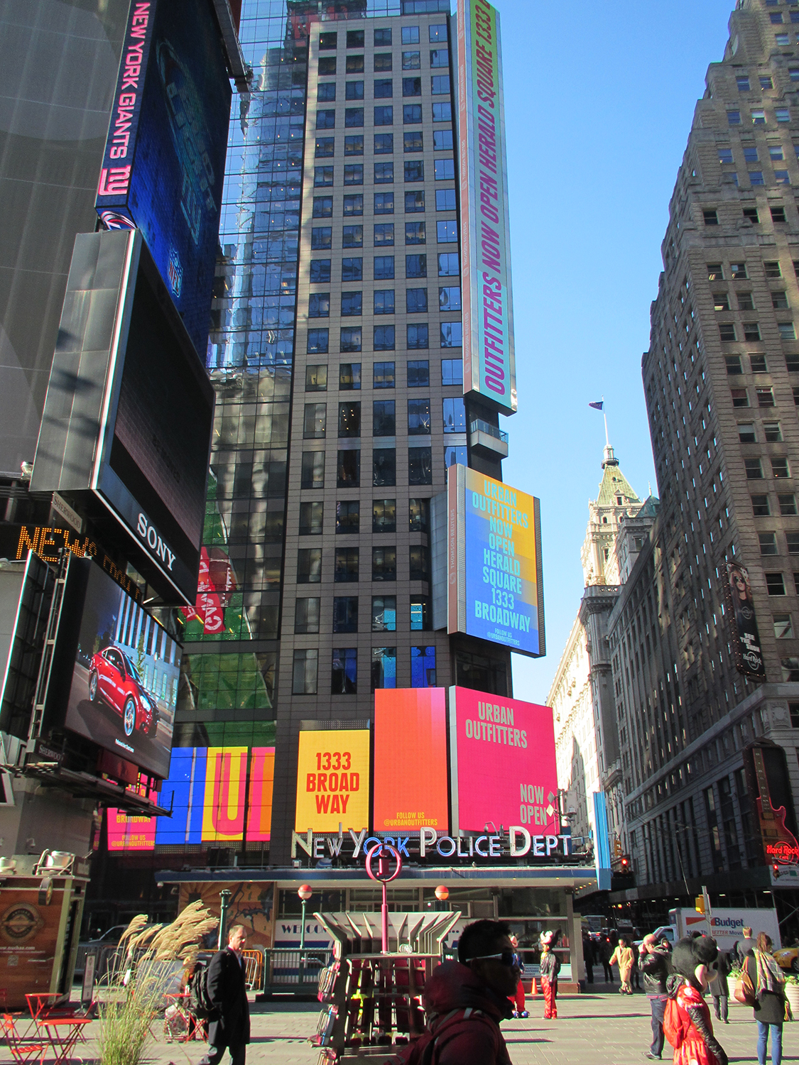
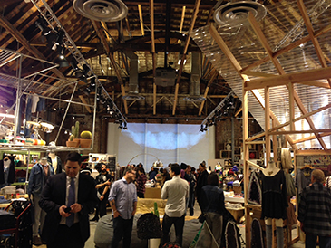
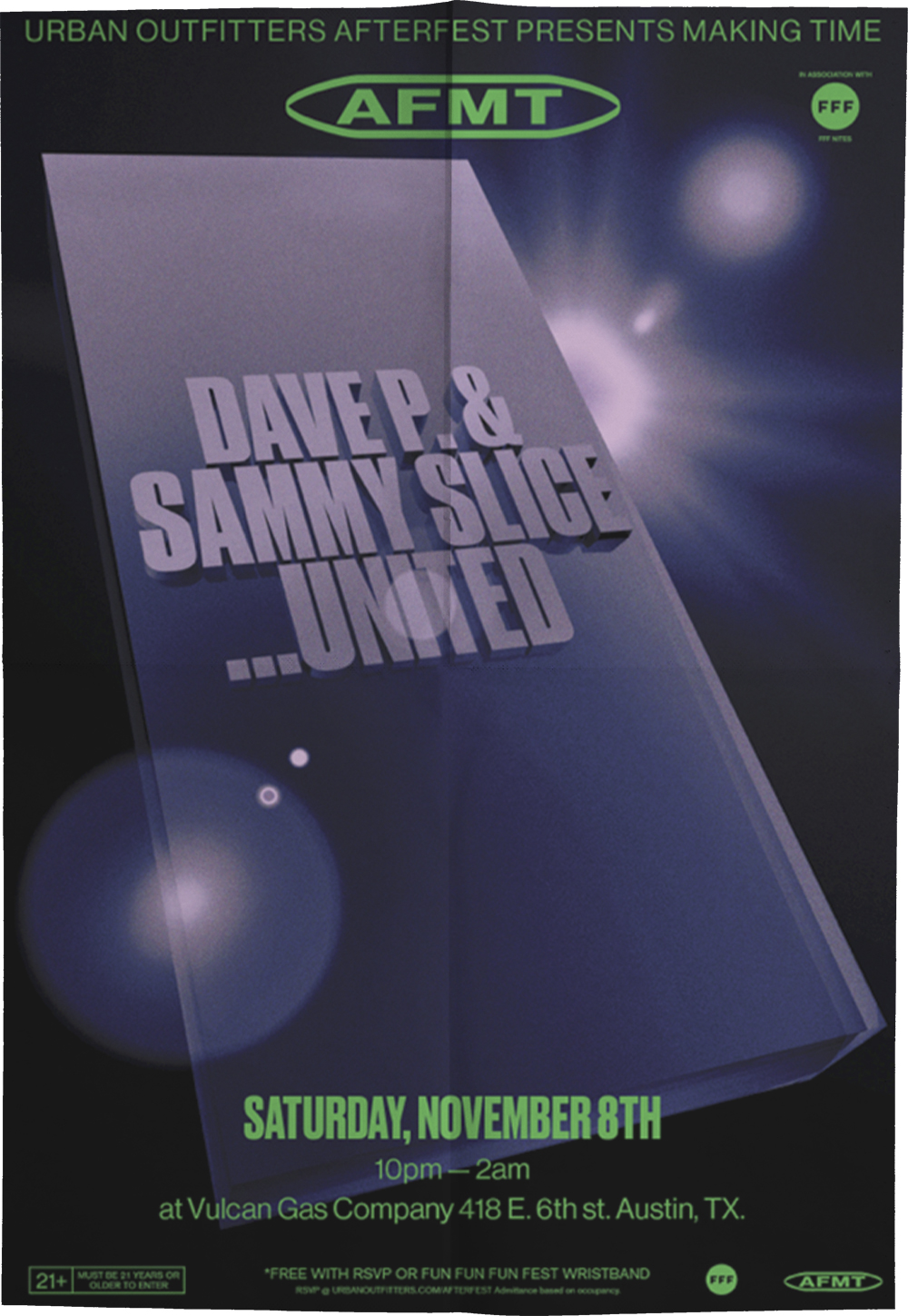
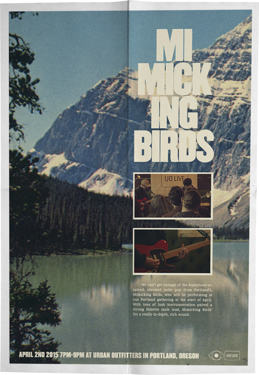
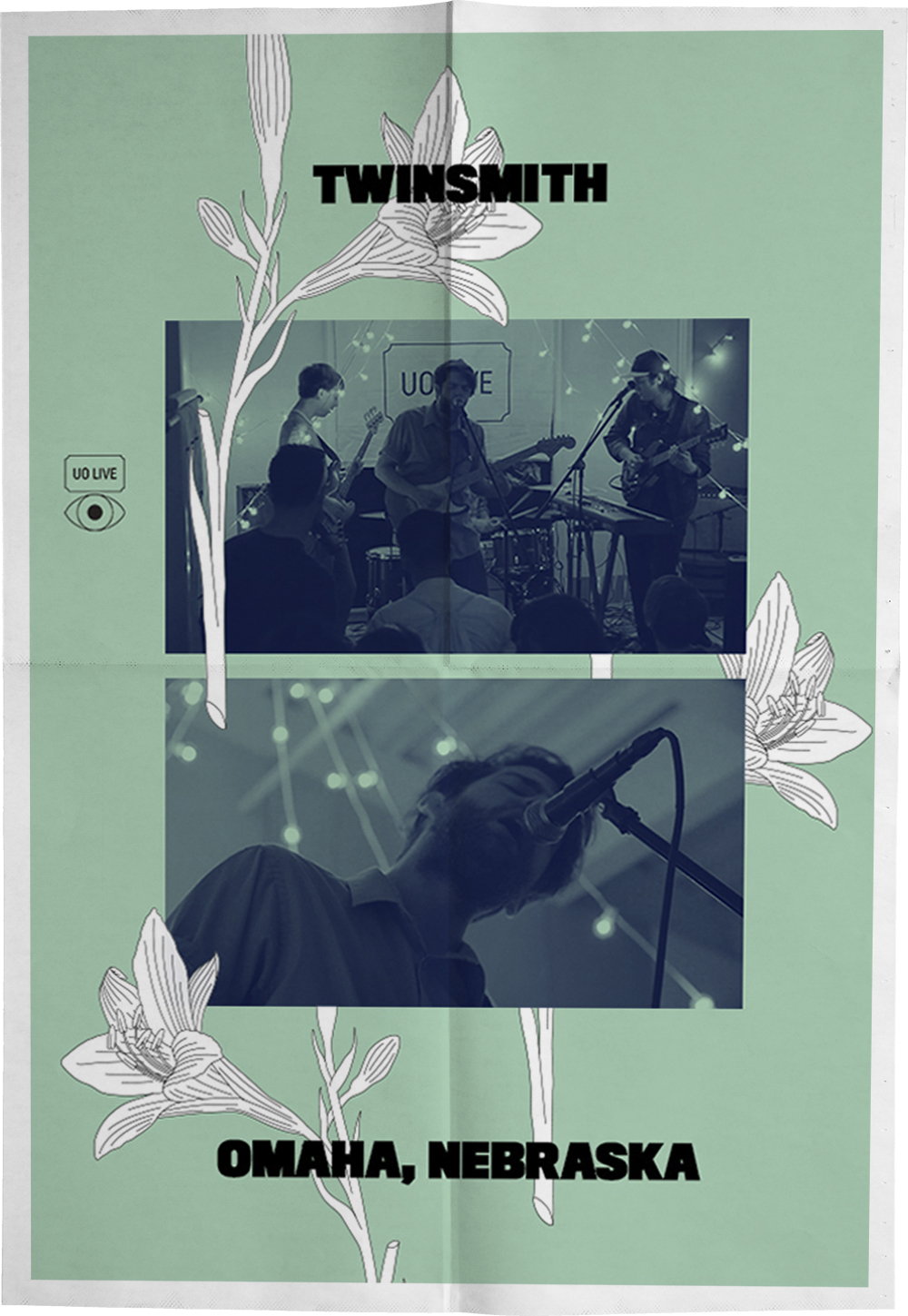
Projects include: Times Square UO Spot, UO Rialto Store Projections, 4th of July lettering, UOTV, UO Halloween graphics, UO Afterfest Making Time event promo, and Labor Day lettering and graphics.
Animated music video for Philadelphia/Minneapolis band Carroll for “Bad Water” off of their self-titled album!
Collaborating with Peter Steineck, we created a 30-second spot across 13 billboards in Times Square.
Working in collaboration with Peter Steineck, we created a series of animations to be projected into the UO in downtown LA as a nod to the building’s history as the Rialto Theater.
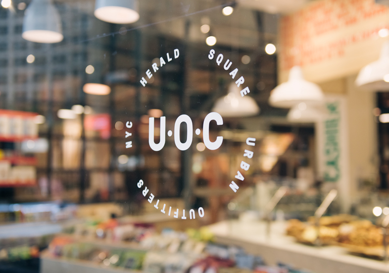
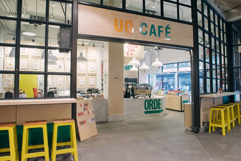
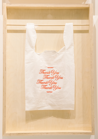
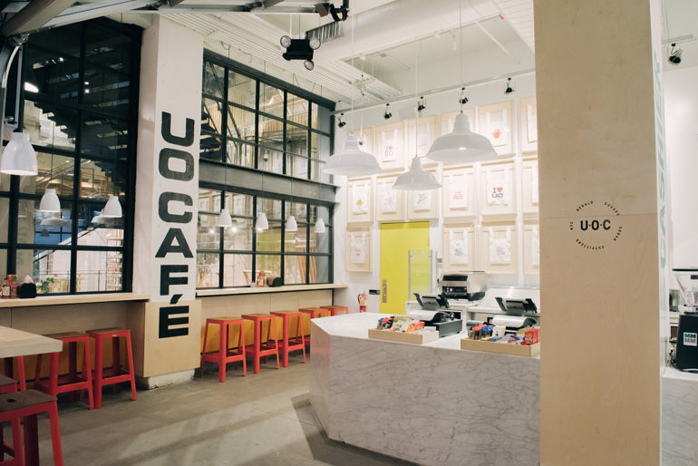
Logotypes, collateral, and supporting graphics for the UO Café located in the Herald Square store in NYC. Created in collaboration with Ian Rousey. Art Direction: Dan Kent & Matt Owen.


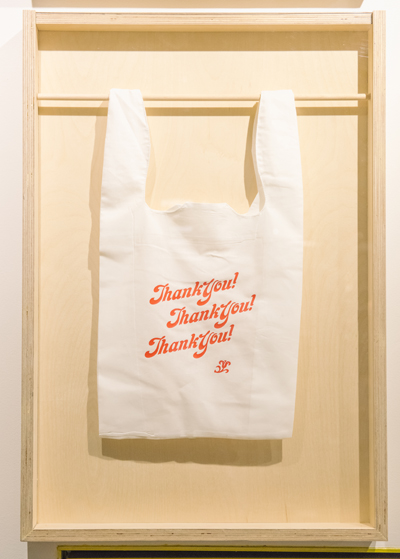
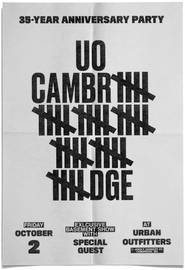
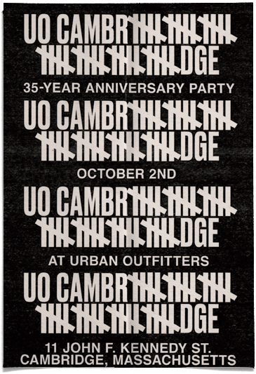
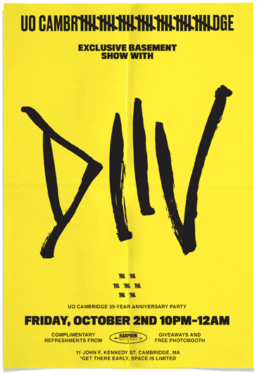
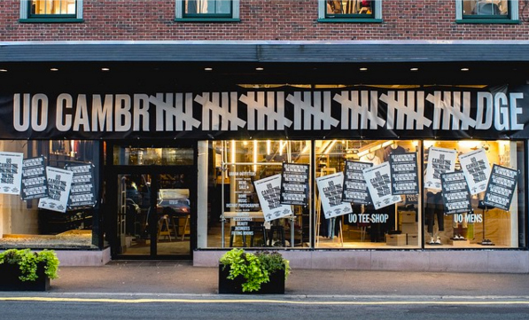
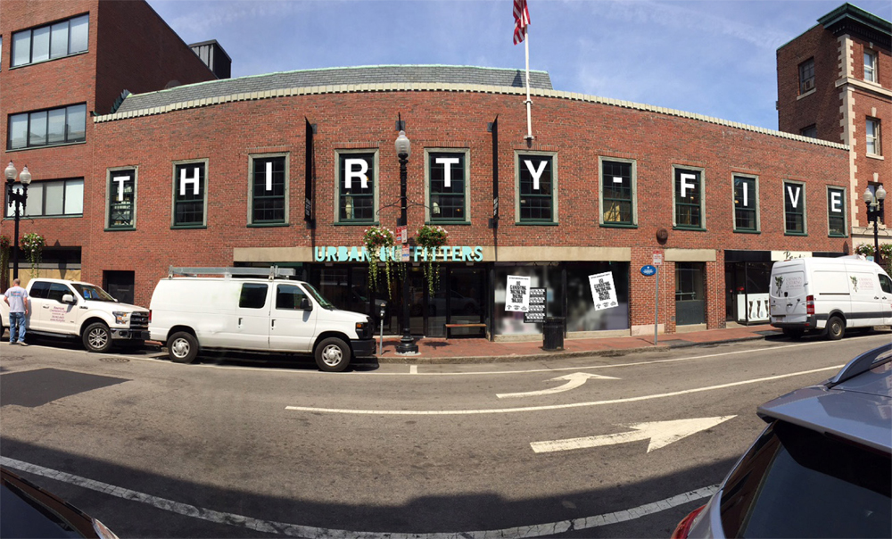
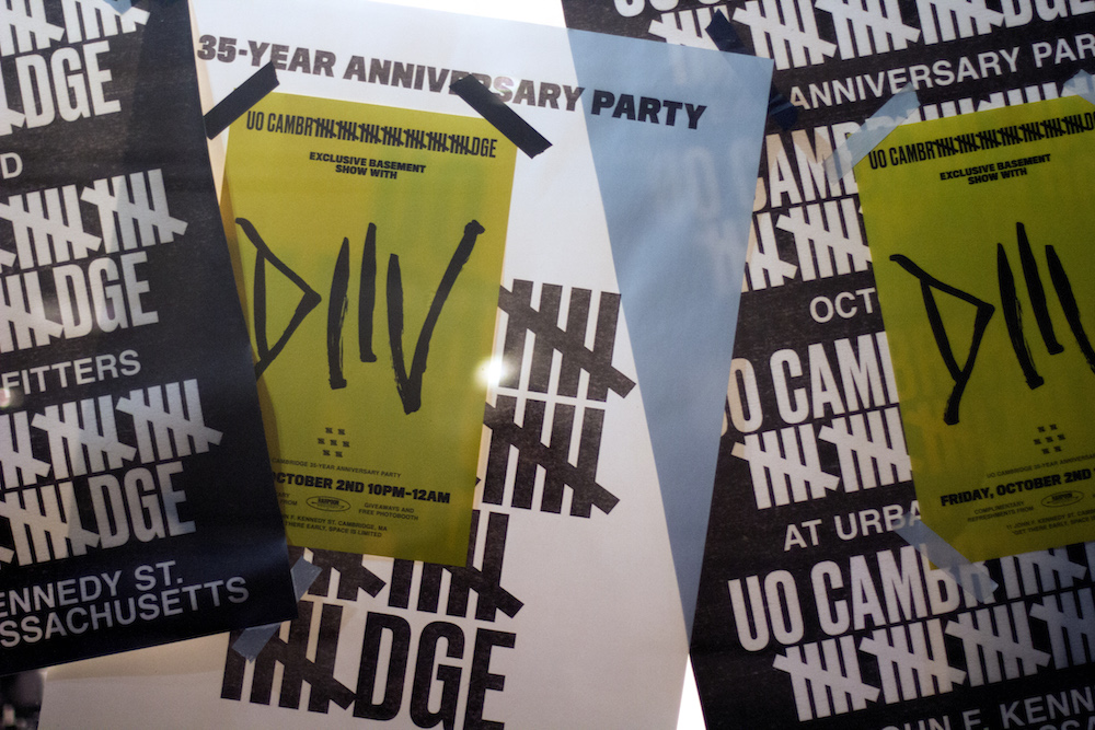
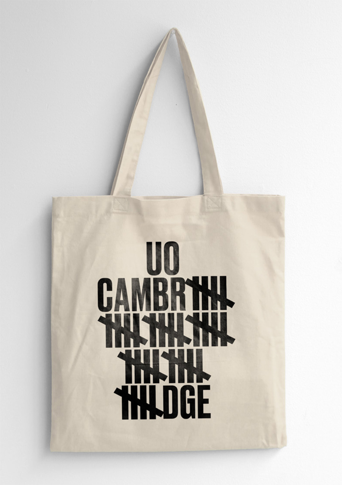
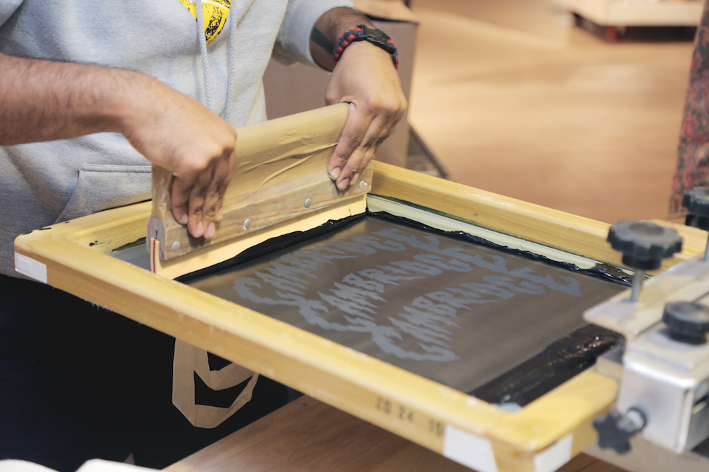
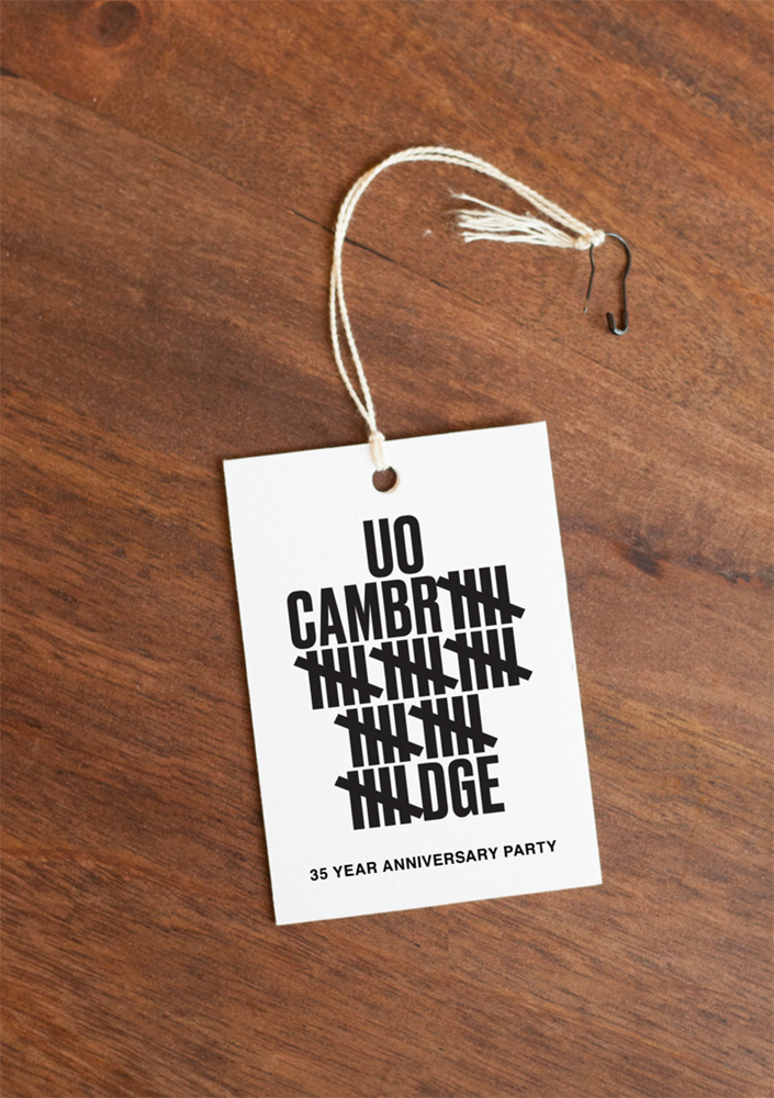
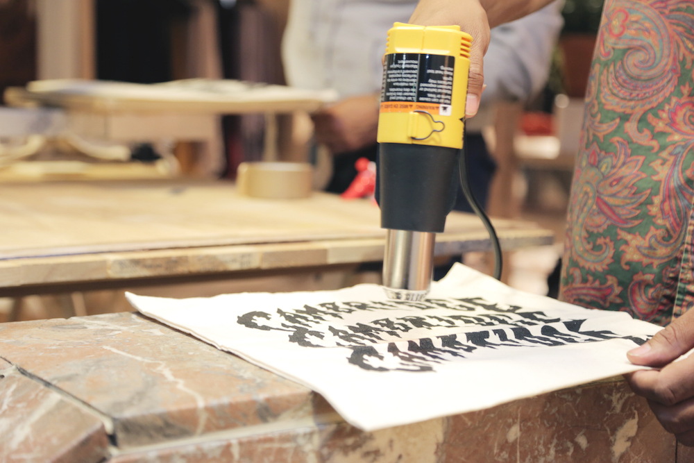
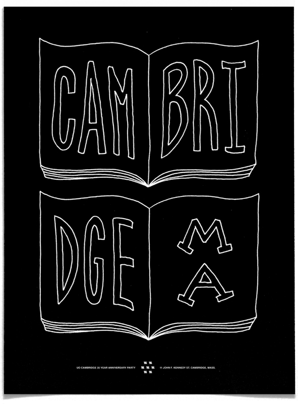
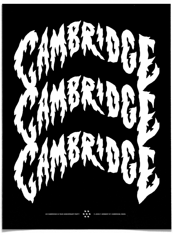
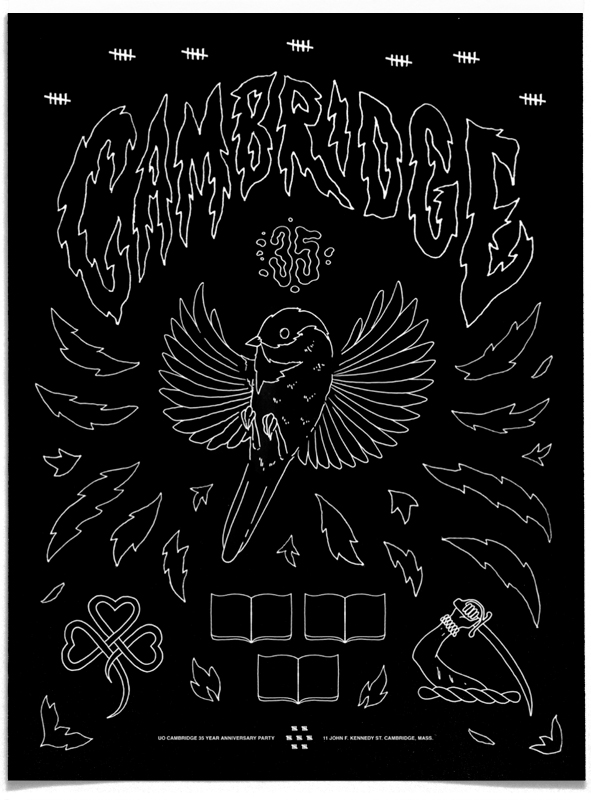
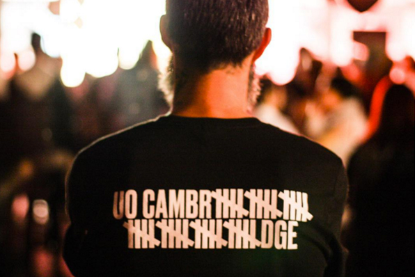
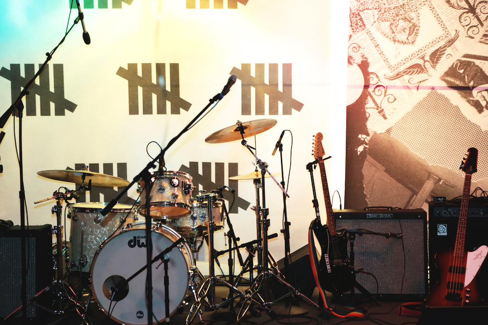
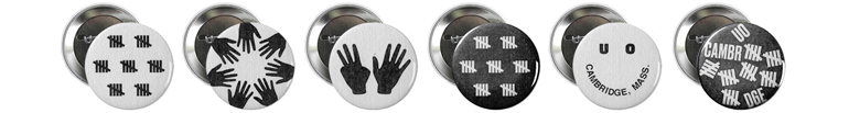
UO Cambridge turned 35 in 2015, I was asked to create a visual identity for the event materials. It was the first UO concept store to cater to local customers (specifically the local punk scene), carrying a lot of black and white clothing. The store’s unique history informed the visual system for the event. Event photos below are from Instagram and the UO blog. Read more here.

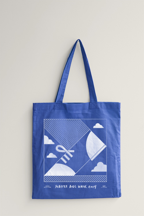
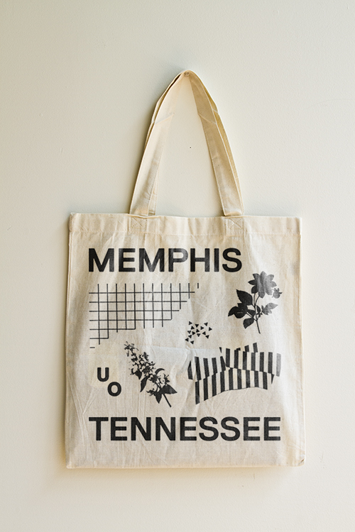
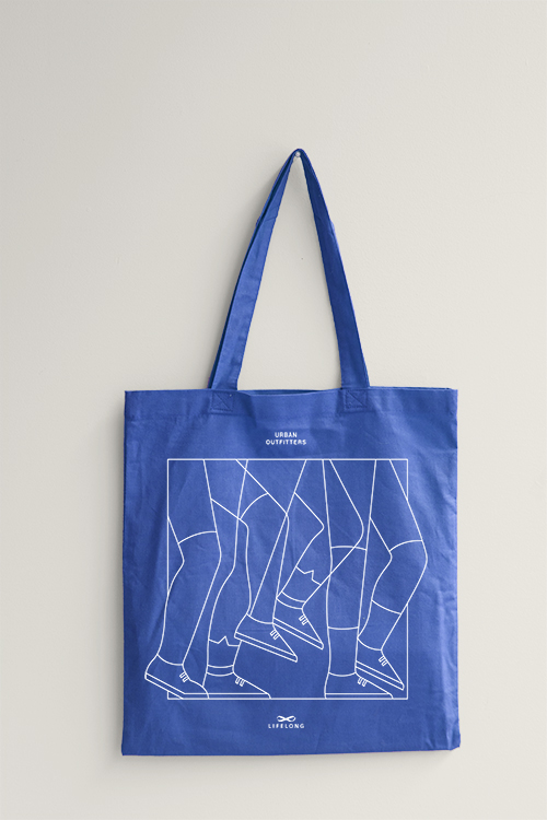
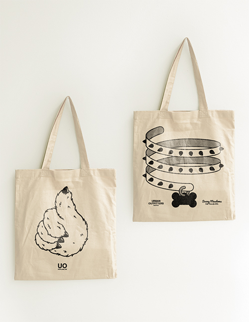
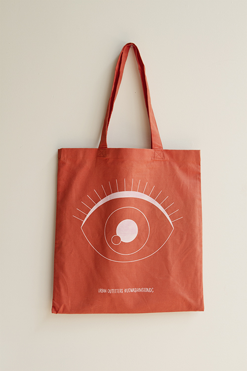
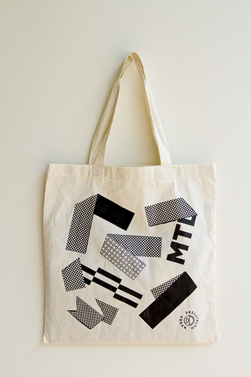
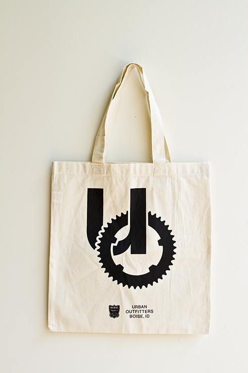
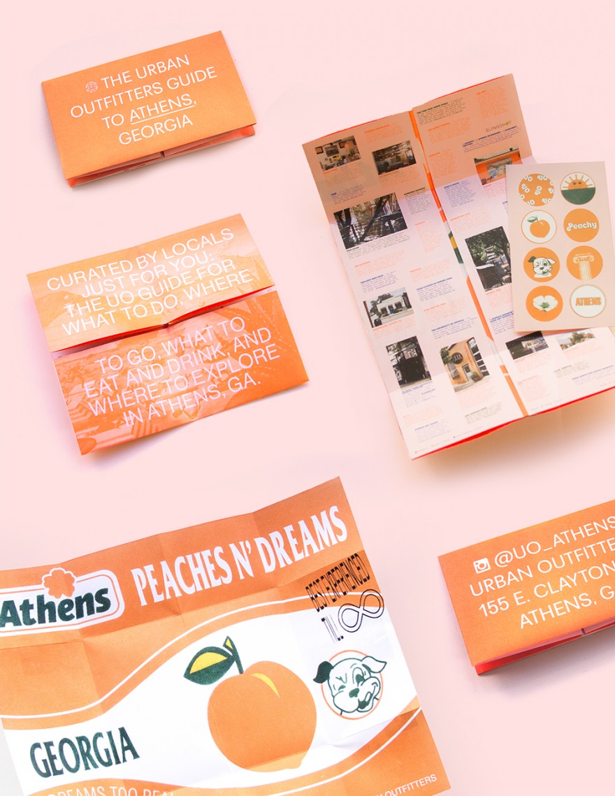
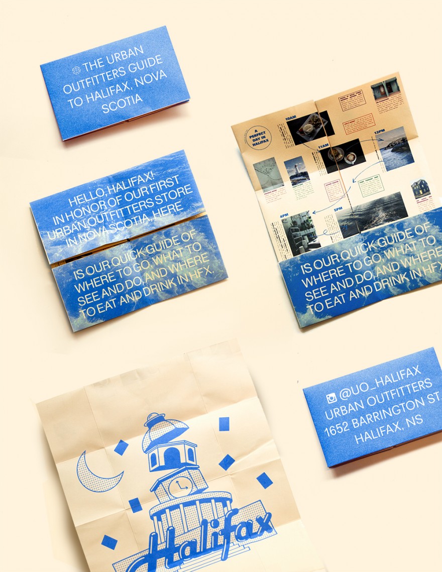
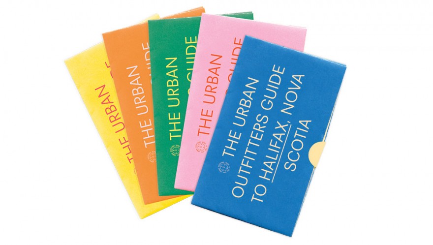
A series of city guides created for cities where new Urban Outfitters’ open (Athens GA, and HFX Nova Scotia pictured here). Graphics by Steph Miller. Art Direction: Dan Kent, Ian Rousey, and Matt Owen.

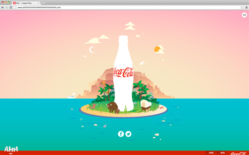
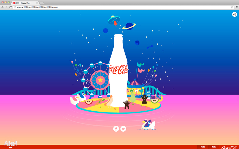
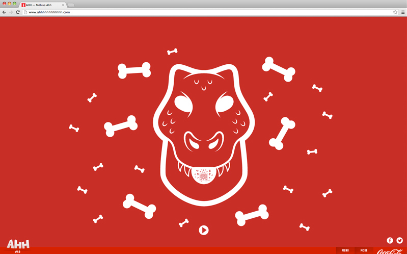
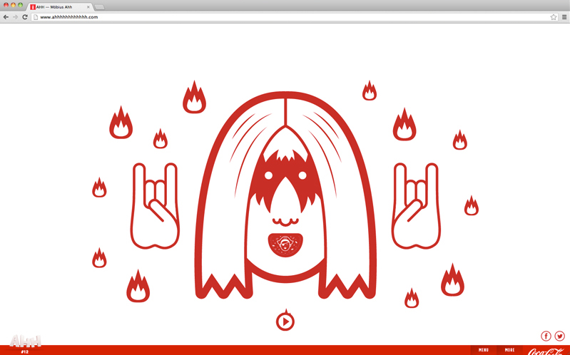
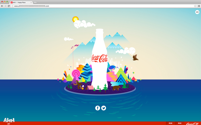
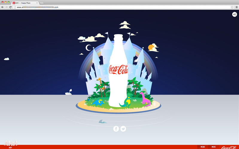
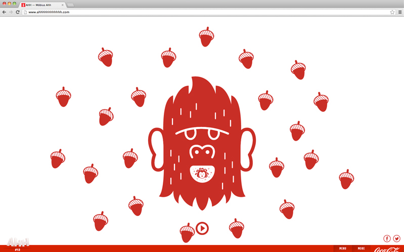
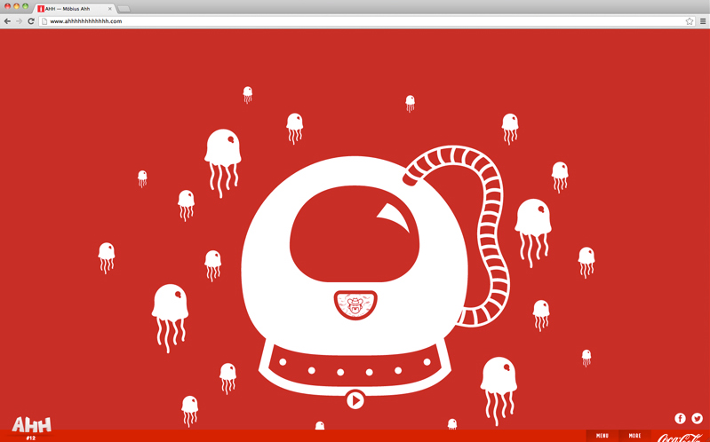
I worked with Süperfad (via Wieden+Kennedy) to generate a series of images/loops for two sites within their massive ‘Coca Cola Ahh Effect’ 60-site mobile campaign. Visit Happy Place and Möbius Ahh to try them out!


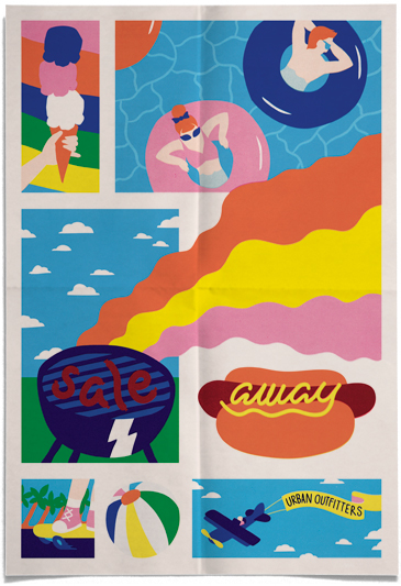
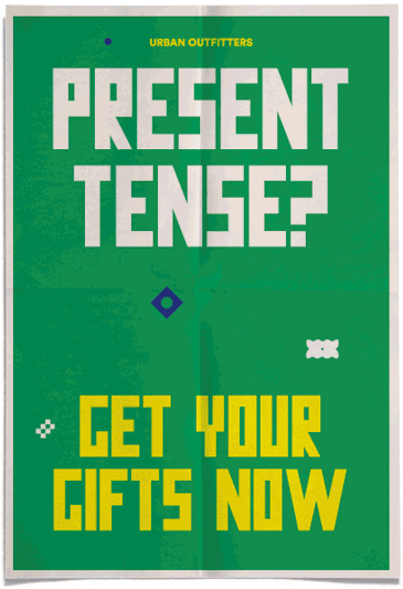
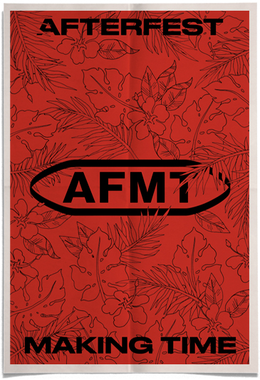
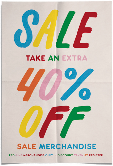
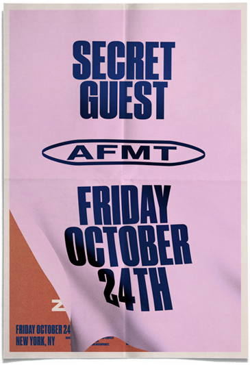
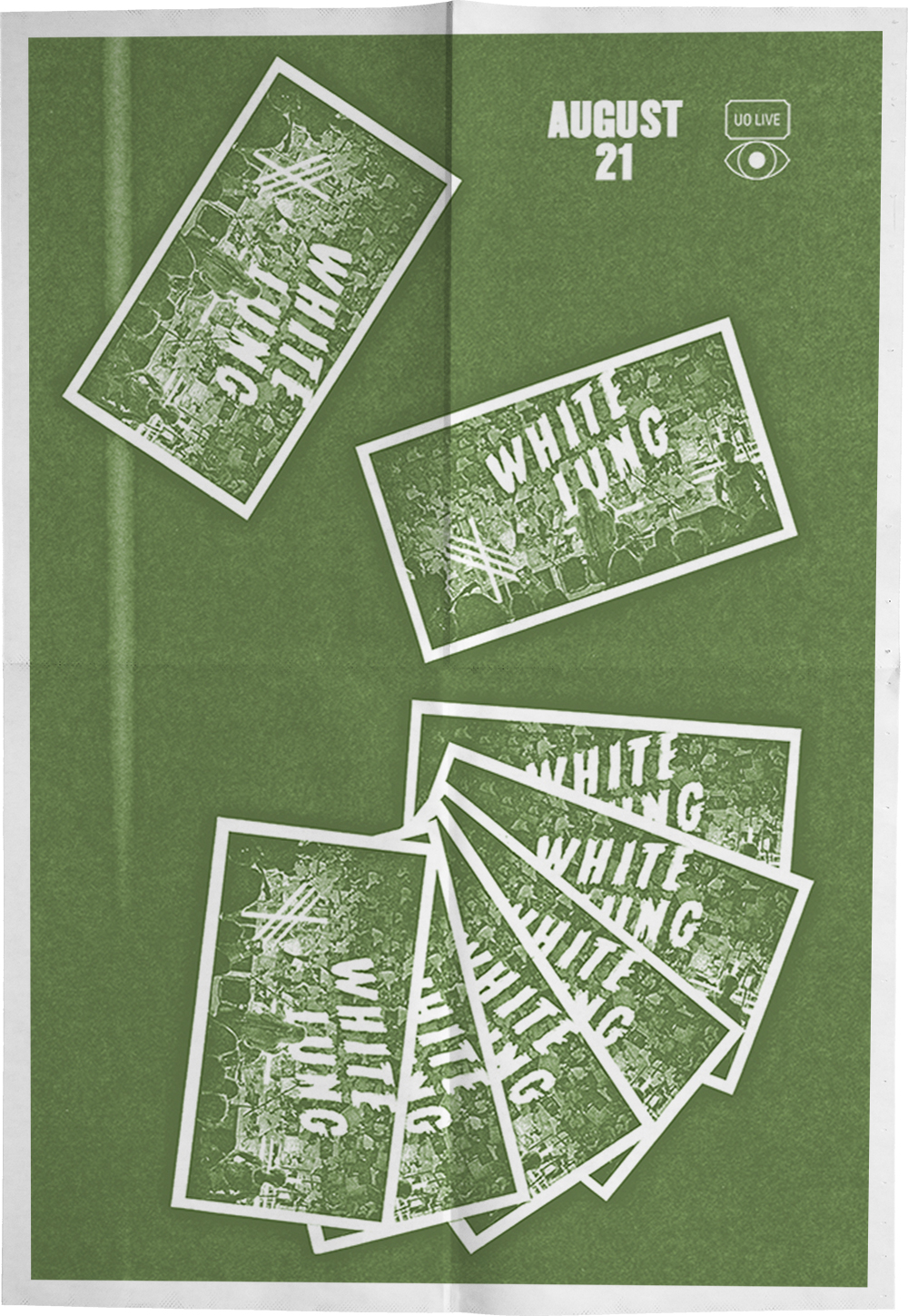
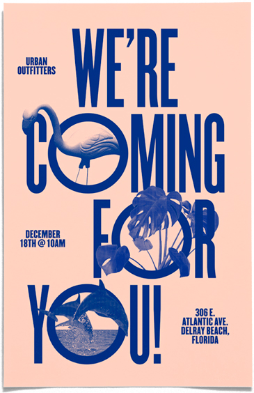
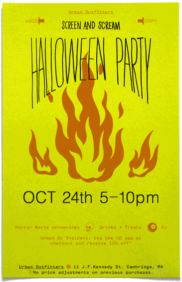
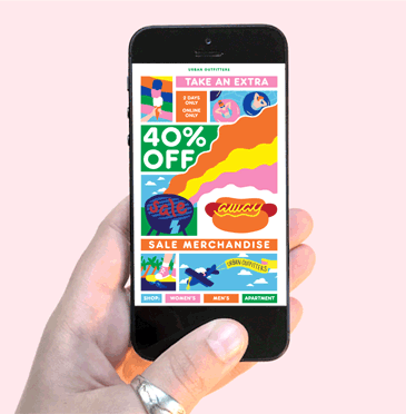
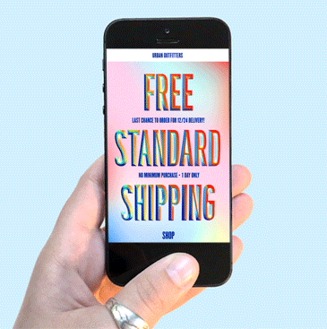
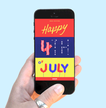
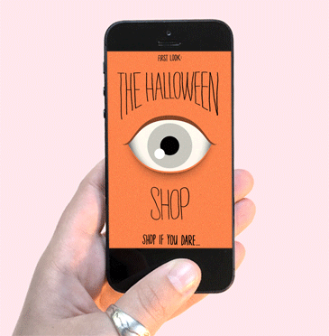
Posters: Labor Day Sale, Present Tense Sale, Afterfest Making Time (in collaboration with Ted Guerrero, Maria Chimishkyan and Peter Steineck), Wind-Up Wednesday Sale, monolithic AFMT flyer, music posters for BTS15 store display, UO Delray Beach Opening, In-store Halloween Events, and Linnea Sablosky’s Recital. Emails: Labor Day Sale, 4th of July, Free Shipping, and the Halloween Shop.


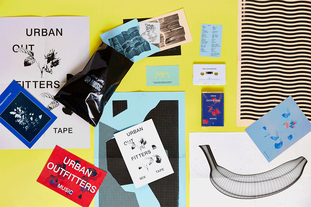
Graphics and ephemera created in collaboration with Ted Guerrero and Maria Chimishkyan to accompany the first UO mixtape giveaway.
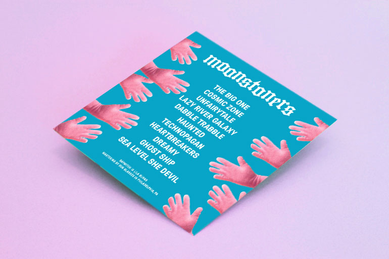
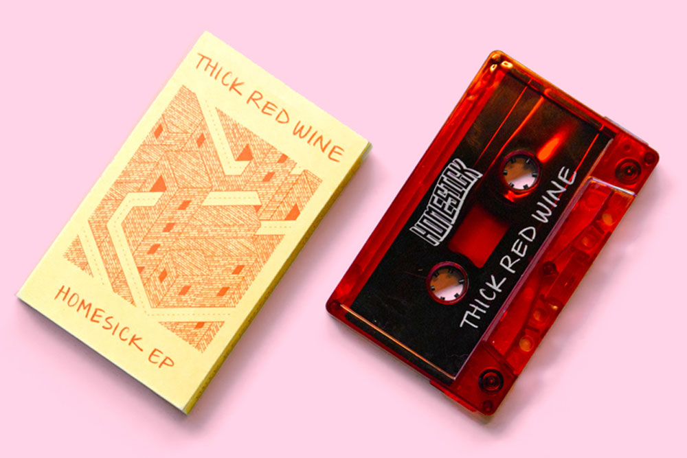
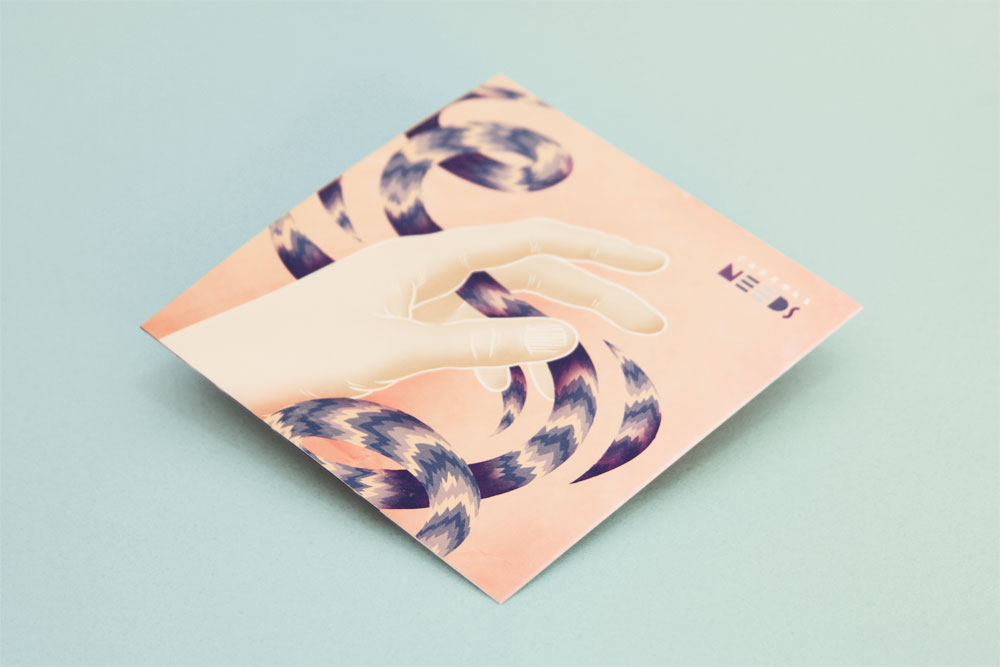
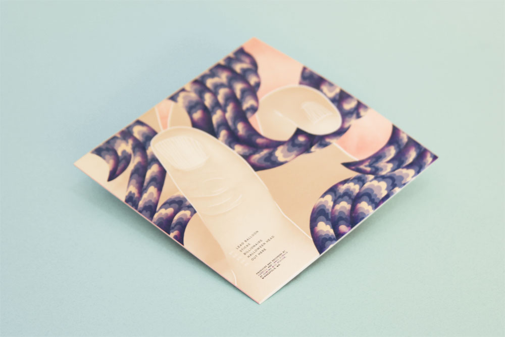
Packaging for Hellaspawn & Moonstoners by Baywitch, Homesick EP by Thick Red Wine and Needs by Carroll. View more music work here.